|
|
|
|
|
|
|
|
|
|
Back to B
|
|
|
|
|
|
|
|
|
|
|
|
|
|
Foundation Book
|
|
|
|
|
|
|
|
|
|
|
|
|
|
In which the right way to thoroughly learn all kinds of
scriptures is clearly explained, and artfully mixed and taught by the
subdivision of figures and letters.
|
|
|
|
|
|
|
|
|
|
|
|
|
|
Illuminated by Jan van den Velde, van Antwerp, Anno 1605.
|
|
|
|
|
|
|
|
|
|
|
|
|
|
General instruction of this book
|
|
|
|
|
|
|
|
|
|
|
|
|
|
Thorough
information to make a good quill
|
|
|
|
|
|
|
|
|
|
|
|
|
|
Many have often marvelled, seeing with what liberty and
power some of my strokes (almost quite against its nature and power)
have been drawn, pushed and pulled. But if they have my quill, and my
hand to direct it, and also my eyes to guide the way, they would know
by experience that they have a strong quill in their own hands, and
some would not believe it is possible what I achieve with her (without
boasting) courage.
|
|
|
|
|
|
|
|
|
|
|
|
|
|
Therefore, before I come to the instruction of the character
of letters, I intend to deal with a little of the nature of the quill,
in which to learn almost all that is involved in writing all kinds of alphabets.
|
|
|
|
|
|
|
|
|
|
|
|
|
|
And though there is no one, however little experienced in
writing, who does not know how to cut a quill, yet I think that the
majority do not know the particulars to be used in cutting the quill,
in order to write with more lightness and grace.
|
|
|
|
|
|
|
|
|
|
|
|
|
|
I will explain my manner, and would much rather be blamed
for elaboration, than be accused of negligence, and not of soundness,
on account of length and other matters of writing, and be able to
prepare the tools for the quill-art of which I profess.
|
|
|
|
|
|
|
|
|
|
|
|
|
|
First of all it is necessary (as is also the case with all artists and other craftsmen) to have good tools. Whoever
wants to describe the sheet will have to do with a good penknife, not
too wide, nor too thick, but with a subtle straight cut, the point
slightly curved like a hawk's beak, not too short, and the handle
somewhat stiff in the hand, to be able so much more to act skillfully.
|
|
|
|
|
|
|
|
|
|
|
|
|
|
|
|
|
|
|
|
|
|
|
|
|
|
|
|
Then,
to cut a good quill, one shall hold the shaft with two fingers, namely,
with the thumb and the forefinger of the left hand, resting it on the
third, and the penknife in the right hand up to an inch wide from the
tip because you can cut more confidently that way.
|
|
|
|
|
|
|
Then
you will hold the shaft of the feather with the front part of the blade, with the
thumb of the right hand resting on the fourth and last finger of the
left hand.
|
|
|
|
|
|
|
Then
work on the shaft. Let your right hand thumb rest on the 4th and 5th
finger of your left hand and open the quill with one long cut along its
belly. After that two cuts on both sides towards the beak. Keep the
beak of de quill broad. Then turn the quill with the belly down and
with the point of the knife at the broad tip, make the slit by pushing
with the point. If the slit isn't long enough, push it with the nail of
your right thumb a bit further open. others
use the hilt of the penknife or some other shank, but that does not
work well.
|
|
|
|
|
|
|
Then
you shall straighten the sides of the beak, thinning them and
sharpening them, until you see that you are able to give the last edge:
the opening near the beak you shall reduce but half, and keep it so
long like the beak, which I make as broad and narrow as the letters I
intend to write.
|
|
|
|
|
|
|
Then
cut the quill evenly on both sides of the slit and cut the broad beak
to required size. If the shaft is too hard or stiff: make the slit a
bit longer. If the shaft is too soft, make it shorter, but always try
the quill first.
|
|
|
|
|
|
|
|
|
|
|
|
|
|
Remains
the necessary and most important, which is to shorten the beak, best to
do that on the nail of your left thumb, with the rounded side up, a
small cut towards the point to make the material a little thinner, so
that your thin lines will be so much finer and crispier.
|
|
|
|
|
|
|
You
must then cut off the point on the thumb, you will then hold the
penknife with the cut on the back of the beak a little slanted, and cut
from top to bottom to the point, to make binding the letters together
as much cleaner as possible and make it more subtle.
|
|
|
|
|
|
|
Then take the penknife again to cut the tip of the beak straight off, and smooth it out on both sides.
|
|
|
|
|
|
|
You
make the right angle a bit shorter and a bit thinner or smaller than
the left side, a bit shorter I say, because in order to hold the pen
properly one has to bend the hand a little bit to the right side, and a
bit thinner and smaller, because the ink then flows all the better.
|
|
|
|
|
|
|
The
left side is a bit coarser, because it has to endure more, caused by
the fact that the pen is usually always written from the left side.
|
|
|
|
|
|
|
|
|
|
|
|
|
|
Now
to admonish you that it should be cut so sharply that there should be
no raggedness or roughness, I think it unnecessary, since you may judge
for yourself that good instruments are always the most able to help you
with that.
|
|
|
|
|
|
|
|
|
|
|
|
|
|
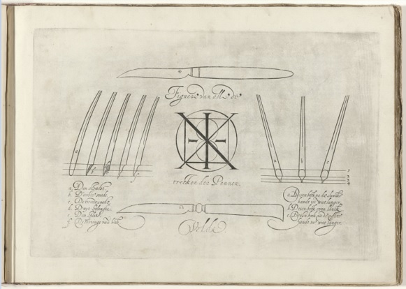
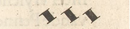
Now
that the way of cutting the pen properly has been given, you should
also know that there are all kinds of pens: first, one that is even
from the beak and of equal length, and second, two others with an odd beak and
uneven, which I should here, as well as the way of the penknife, would
like to point out in many figures, the better to reveal to everyone my
teachings.
|
|
|
|
|
|
|
|
|
|
|
|
|
|

|
|
|
|
|
|
|
a. this beak is towards the left a bit longer
b. this beak is left and right the same
c. this beak is towards the right a bit longer
|
|
|
|
|
|
|
|
|
|
|
|
|
|
For which type of letters these three types of quills will be used for.
|
|
|
|
|
|
|
|
|
|
|
|
|
|
Now
to clarify for what purpose I use these three kinds of pens, it should
be known that I use the smooth pen for all sorts of coarse erect
Fracture writings, Textur writings, Bastard letters, large and small,
and then all other fixed square and round letters, to write
inscriptions or some fencing and delightful spells.
|
|
|
|
|
|
|
|
|
|
|
|
|
|
The
two unequals I usually use for current affairs, such as High German and
Dutch, the first because the beak against the right hand is longer than
the left one, I usually use to write a backhand, and the other, because
the beak of the left hand is longer than the right one, for a forward
hand, and also for writing an Italian hand, except that then the mouth
must be a little longer and sharper because of the long subtlety and
roundness of those letters, as also the mouth of the pen for a Dutch or
High German handwriting, which should be shorter, because the letters
are much shorter and bolder.
|
|
|
|
|
|
|
|
|
|
|
|
|
|
A
wider use is also another way of pens, when I desire to write a round
running hand, whose mouth, after I have cut off the smooth nib, I make
a little roundish, on both sides the corners are slightly reduced, but
not so much as to make her lose the flatness, just a little bit of the
edge, because it rolls better then, and this is without a doubt the one
that gives the most speed, because anything round has to run a lot.
|
|
|
|
|
|
|
|
|
|
|
|
|
|
I
also use a similar pen to draw my lines, but take a shaft that is a bit
stiff, make it a bit longer, and the split too, so that the ink will
follow a bit more slowly and with steps.
|
|
|
|
|
|
|
And
to prevent it from being obtrusive and sprinkling (you won't see or
encounter that much in my writing) so I'm running it up against the
back a little heeled, like a ship tacking sweetly, so that it's all the
sweeter across the paper floats, for wanting to sail gliding, or partly
against the back, one can hardly prevent her from struggling and the
lines falling out wholly impure, which equality and purity I hold to be
great art and science, as being one of the courage and special touches
that may bring a masterful writer to fame.
|
|
|
|
|
|
|
|
|
|
|
|
|
|
And
in order to make the lovers and doers of pens discover my manner still
more widely, I was willing to let them know how I use my strength
(which I do not pride myself on except that I received it by the grace
of God) in the actions of the pen exceptionally on a large sheet.
|
|
|
|
|
|
|
So I take one of the stiffest or hardest shafts, which
you soak in a little water, to be ready in my inkwell, to make it a
little softer and gentler, that it might be more able to draw its lines
that way and to bend, and to endure the heaviness, for though it be
slackened a little by water or by ink, yet by its features it remains
steadfast, when I have applied the softening, which others that are
softer or slacker do not power. |
|
|
|
|
|
|
For, as soon as the beak has taken the ink, they will
immediately succumb under the hand, whence it follows that the features
so pious and stout will not fall from such pens. |
|
|
|
|
|
|
I also take for this purpose an ink that flows and
runs, without putting any cotton in it, so that the hairs in the pen
will not hinder the writing pure and clean. |
|
|
|
|
|
|
I
also prefer smooth and strongly glued paper for this purpose, for the
sake of which the pen itself advances more lightly, and if I see that
my ink runs too much, I throw a little bit of gum into my inkwell to
bind it a little more, which I also do when I want to write a quiet or
slow hand.
|
|
|
|
|
|
|
If
not, take a kind of paper which is a little slower, which does not like
to take the writing, unless the pen wears out too quickly, and the hand
gets tired, also because I don't write very slow, because today's
merchants, clerks, and copyists do not esteem them highly, for whom it
is enough to have before their eyes a clean and steady running letter,
without having to worry about curiosities.
|
|
|
|
|
|
|
Those
who must all manage perfect writting are noblemen, lawyers,
secretaries, notaries and schoolmasters, for them it is right and
foremost that they can write several common writings perfectly, in
order to be the better and more able in the service of princes and
lords, and will help the progress of various states and republics.
|
|
|
|
|
|
|
|
|
|
|
|
|
|
How to properly grasp or hold the pen.
|
|
|
|
|
|
|
|
|
|
|
|
|
|
Hitherto
I have thought of the carving and making of the pen, as well as the
variety of how to act, now it is also necessary to know how to grasp,
hold, and rule it.
|
|
|
|
|
|
|
I
usually hold them with three fingers, namely, with the thumb, the front
and the middle finger, in such a way that the first finger and the
thumb are equal, and the middle finger slightly outward, next to the
nails and not over it, the two nearer will follow the middle finger,
which will rest a little on the gold finger, that again on the little
finger, so that the hand rests and rests on these two, but more on the
little finger, with which I alone but touch the paper, that is to say,
from the two little phalanges upwards towards the nail, to prevent them
from touching the other fingers, which hold the pen, that they do not
prevent them from bending or moving and moving forward, after one has
quickly desires to write.
|
|
|
|
|
|
|
I
also keep her weight so that the top of the point corresponds to the
direction of the right shoulder, and always have the arm free up to the
elbow, leaning a little on the table with that, leaving most of the
shoulder to hang.
|
|
|
|
|
|
|
I
support the body with the left arm, which I place on the table to
illuminate the right, paying particular attention that the paper or
book I am writing is right in front of me, and the body is not twisted.
|
|
|
|
|
|
|
I
also do not close the pen too tightly between the fingers, and do not
push it too firmly on the paper, because I find that if you hold the
pen too tightly and push too much, the fingers will soon get tired.
|
|
|
|
|
|
|
The
same is true of lying or resting too much with one's body on the table,
it prevents one from not writing skillfully, and one cannot maintain
evenness and thickness and breadth, which is the jewel of all writing.
|
|
|
|
|
|
|
In
short, I keep the pen in such condition that when I draw a downward
line the way of the plumb line, or a transverse trace, beginning from
the left hand to the right, or make with the purl side of the pen, that
that is always made with the flat part, that is with the width of the
nib.
|
|
|
|
|
|
|
Contrarily,
the different lines over oblique sides, from left to right, or from
right to left, then I take with a sharp, or rather with the edge, that
is the subtle and thin, starting with the right or left corner .
|
|
|
|
|
|
|
In order to arrive at a broader explanation, I have listed the most necessary figures here.
|
|
|
|
|
|
|
|
|
|
|
|
|
|

|
|
|
|
|
|
|
|
|
|
|
|
|

|
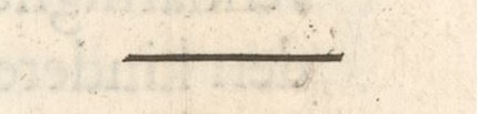
1 The straight descending line, Perpendicularis in Latin, was drawn like this with the width of the pen.
|
|
|
|
|
|

|
2 The descending diagonal line the width of the pen, called Obliquus.
|
|
|
|
|
|

|
3 And the other opposite line, called Diagonalis, was drawn with the edge of the pen in this way.
|
|
|
|
|
|

|
4 Another straight transverse line drawn with the width of the pen.
|
|
|
|
|
|

|
5 Yet another drawn half-width line from the pen.
|
|
|
|
|
|
|
6 Made another one with the pen's cut.
|
|
|
|
|
|

|
7 Other lines taken with a reversal.
|
|
|
|
|
|
|
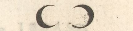
8 Some semicircular lines.
|
|
|
|
|
|

|
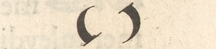
9 Some extended semicircular lines.
|
|
|
|
|
|
|
10 Other curved semicircular lines.
|
|
|
|
|
|

|
11 A whole round line.
|
|
|
|
|
|

|
12 A braided round line.
|
|
|
|
|
|

|
13 Half Falling Ovals.
|
|
|
|
|
|

|
14 A whole falling oval.
|
|
|
|
|
|
|
15 Elongated squares.
|
|
|
|
|
|

|
16 Curved squares.
|
|
|
|
|
|

|
17 Square diamonds.
|
|
|
|
|
|
|
18 Curved diamonds.
|
|
|
|
|
|

|
19 Round Points.
|
|
|
|
|
|
|
|
|
|
|
|
|
|
These
examples of flat lines should be diligently observed by anyone who
wants to achieve the perfection of the pen, I can assure you that it
will be no small profit and advantage, and you will find that our main
writings have their origin in this, as I hope to give fuller
explanations here and later on, I advise anyone who wants to become a
professional to teach children how to write, that they build their
lines from it, if those who are beginning to learn for a handwriting
practice it for so long, until they shall be able to learn to make
letters, taking special care that they hold the pen well, and the
manner in which it shall enter in the flat and in the cut, that they
may write with a fair and steady hand, and not use wrong manners which
they are very ill to dissuade, and prevents them from learning a good
disposition of writing.
|
|
|
|
|
|
|
|
|
|
|
|
|
|
Declaration of the figures as proposed.
|
|
|
|
|
|
|
|
|
|
|
|
|
|
Before
I come to the foundations of our writings, I should first like to
clarify what is meant by the above-mentioned figures, so as to have a
more competent introduction to the teaching of letters.
|
|
|
|
|
|
|
The most important line, and also the most difficult, is the Perpendicularis,
which must be drawn with the flat of the pen from top right down, so
long and so short to the letter you want to write, which line should be
especially learned as being the one from which most of the letters take
its form.
|
|
|
|
|
|
|
The Oblique and the Diagonals line, as well as the others, fall much easier and have more freedom.
|
|
|
|
|
|
|
These
are drawn, one with the flat of the pen starting from the left hand to
the right going diagonally downwards, and returning from the right hand
to the left upwards.
|
|
|
|
|
|
|
The
others who are drawn in the square figures from one corner to the other
is the one who joins letters with the edge of the pen, either from the
middle of the body from the head, or from one leg to the other of
downwards upwards, for thereby it is separating distance and width
which the letter ought to have.
|
|
|
|
|
|
|
The
other lines, namely the transverse ones, are the ones that run right
through the letters: the first that is passed through the coarse with a
flat, the second that is passed through the midline with a semi-flat,
and the third that with the edge of the pen swept through the small
letters.
|
|
|
|
|
|
|
They
are also used (with the exception of the last two) to make the head and
foot of such letters, because their nature requires it, as there are
the Roman square and round letter, the French, and our stationary
letter.
|
|
|
|
|
|
|
Curved and round
lines are drawn with the edge of the pen, ending without interruption
with the flat, or starting with the flat and ending with the edge.
|
|
|
|
|
|
|
Half and full ovals are the ones on which the Italian hand is most based.
|
|
|
|
|
|
|
Squares serve as feet of the Texture letter.
|
|
|
|
|
|
|
Diamonds as feet of the Fracture and the Bastard letter. |
|
|
|
|
|
|
Points are made with a push of the pen to put on an i, and to close a whole sentence, either in the middle or at the end of the lines.
|
|
|
|
|
|
|
What
more is required of this for the art-lovers, practice will teach, and
the foundations of it, as every one will attain perfect perfection
through constant study, for Not without effort.
|
|
|
|
|
|
|
|
|
|
|
|
|
|
Instruction of the square Roman letter.
|
|
|
|
|
|
|
|
|
|
|
|
|
|

|
|
|
|
|
|
|
|
|
|
|
|
|
|
Now,
in order to come from all these lines to an application to all
writings, we shall first deal with the ancient Roman letter, which
seems to have descended from the Greeks, and is thus a square letter,
which I have arranged here to make its proportions the more vivid,
positing these few figures standing above the foundation to the very
bottom of the foundation itself: namely, the Perpendicular line, the reign of lines that go straight down, the Oblique line for all that go obliquely from the left hand to the right , the Diagonal line for all those half-flat strokes that go against it from the right hand to the left, and the Transverse line that is made with half the flat pen for all lines that go across and through the middle below and above the letter.
|
|
|
|
|
|
|
And the Round
line for all that fall round, which is approached with the edge of the
pen, as well as those of all other lines that are sharp, as can clearly
be seen from these figures.
|
|
|
|
|
|
|
|
|
|
|
|
|
|
Instruction of the round Roman letter. |
|
|
|
|
|
|
|
|
|
|
|
|
|

|
|
|
|
|
|
|
|
|
|
|
|
|
|
Those
who have practiced well on the square Roman letter will therefore
easily come to know whatever form it takes from the few figures
mentioned above, and especially from the i, o, and f, which rule most
of the entire corpus of these letters. , otherwise have no difference,
except that some lines stand out under and over her corpus (that is the
body).
|
|
|
|
|
|
|
And
to clarify here what I mean by its corpus, so it will be known that I
call the body of the letter that which is enclosed between two
parallels or lines, and name the members that is, the lines that rise
below and above it, which (in order to determine its proportions) I
make rise above it neither higher nor lower than once as long as its
body is large, except for the t, which must protrude above the line
only one-fourth of its height, as also in the image is displayed.
|
|
|
|
|
|
|
There
are more and other Roman letters, but these two are the ones most in
use today, from which ground and foundations all others can be easily
understood and made.
|
|
|
|
|
|
|
Therefore
I beseech the enthusiast to content himself with these, and to practice
in the manner now most in demand, and most esteemed, when there be the
new Italian, Spanish, French, and Dutch running hands, from which I
recall intend to deal with.
|
|
|
|
|
|
|
|
|
|
|
|
|
|
Spanish letter instruction.
|
|
|
|
|
|
|
|
|
|
|
|
|
|
...
|
|
|
|
|
|
|
|
|
|
|
|
|
|
Description of the Italian letters.
|
|
|
|
|
|
|
|
|
|
|
|
|
|

|
|
|
|
|
|
|
|
|
|
|
|
|
|
The Italian writings most commonly used by modern writers are four, namely Letra Formata, Posée, Cancellaresca and Corsiva which is the youngest of them all.
|
|
|
|
|
|
|
Formata
is only for printing and for writing some songs or other verses, it is
the fattest and largest of them all, and is therefore written with a
fat-like pen to make its corpus strong.
|
|
|
|
|
|
|
I
give her almost the width of her height and make lines running out
above and below as long as her body is, and set the lines twice as wide
as she is tall, as you can see in the letter I sent to my E. Heere the
Pensionary and the Rector of our town.
|
|
|
|
|
|
|
The Posée that is a silent or slow letter, and not dissimilar to the Formata, but that it is but a little stockier, and whose limbs or tails are taken with an inversion, unlike those of the Formata, which are blunt and straight be cut off.
|
|
|
|
|
|
|
Posée
I give to copy to my disciples who begin to learn to write with an
Italian hand, the most able to lay a foundation, because it is
assembled letter by letter, without tying them together, which is a bit
too heavy for the arrivals at the beginning.
|
|
|
|
|
|
|
Cancellaresca is, in my opinion, the most delicious, and Corsiva
the most useful and handy, and so I will try to explain its qualities
and my observations a bit more broadly, to display to enthusiasts and
beginners, after which they will see their aims, to imitate as closely
as possible the script lines of such fine letters.
|
|
|
|
|
|
|
For starters, you need to make sure that the letters don't lean forward or backward more like the others
and that all the protruding lines below and above project in the same
direction otherwise it would lead to confusion and disfigurement.
|
|
|
|
|
|
|
Its
corpus will be as long as it is wide, and the spaces between the
letters as large and wide, and the words twice as far apart as it is
wide.
|
|
|
|
|
|
|
The
spaces between the lines shall be three times as wide as it is long, so
that the members projecting below and above do not interfere with each
other and become entangled with each other, their length being one and
a half times as long as the body.
|
|
|
|
|
|
|
The Corsive must be much narrower, and its lines thinner and more subtle so that it can be written all the more skilfully and lightly.
|
|
|
|
|
|
|
I
make it once as long as it is wide, and the protruding lines twice as
long, the letters a little freer and separate from each other, and the
line width four times as wide as that length, so that the pen can so
much better give and prevent its full course that the protruding lines
(which I have called members) do not interfere with each other.
|
|
|
|
|
|
|
|
|
|
|
|
|
|
These four lines will serve as an example for you of the four Italian letters mentioned.
|
|
|
|
|
|
|
|
|
|
|
|
|
|
These
observations I have wished to explain, so that all who love this hand
and seek its way may have some foothold leading to the perfection of
these Royal Writings.
|
|
|
|
|
|
|
I
do know that some curious minds, who pay close attention to my writings
and my teachings, and search them out with great earnestness, seeking
especially to rebuke another, instead of correcting, I would ask them
first to make a good distinction to one and wanting to make another
before they criticize the temperance of my pen.
|
|
|
|
|
|
|
Because
even if it is true that she has deviated from my instructions here and
there and has slipped out, it will still be seen in it that there is no
confusion or disintegration to be found in it.
|
|
|
|
|
|
|
Poets
have their own rules, philosophers have exceptions, and painters their
ornament, so also the pen has a likeness, which through the quick hand
(like one that is very quick or lets its lines run out quietly longer)
also spreads its wings a little wider, then writes as a standing or
slow letter, because the haste one has sometimes misplaces one's foot.
|
|
|
|
|
|
|
|
|
|
|
|
|
|
How to cut and hold the pen to write Italian letters.
|
|
|
|
|
|
|
|
|
|
|
|
|
|
Because
before here I have described little about how to cut a pen to write an
Italian letter, I thought it right before I go further to clarify how
the letters are made in particular, to describe her creation here in
more detail.
|
|
|
|
|
|
|
The
beak will be made somewhat elongated and will not have to be hollowed
out as much as one does to write the German hand, so that the ink will
follow so much lighter, the strokes that come at the beginning or the
end of the letters can already be made with a line in a row.
|
|
|
|
|
|
|
I
also make the beak a bit roundish, the corners on both sides tapering
off a bit, so that it doesn't slow down on the paper but will move all
the faster.
|
|
|
|
|
|
|
The
beak will also be cut as wide and narrow as the thickness and
narrowness of the letter one wants to write and the split as
appropriate in length, to make the quick lines that are placed under
and above the body as fat and lean after she be pushed hard or soft,
and so that one shall know to belong to her stature.
|
|
|
|
|
|
|
And
thus the Italians hold the pen in a different way than we hold our own,
so I have also wanted to describe it here, in order to satisfy all
curious minds, and avoid being accused of not knowing it.
|
|
|
|
|
|
|
Whichever
way I think good, because one thus tenaciously writes the pen so much
lighter and more skilfully: they hold the pen only with the thumbs the
front finger, in such a way as to show the strength of the thumb next
to the first phalanx of the fore finger, which is extended to the side
of the pen, in such a way that it comes to lie next to the third and
last member.
|
|
|
|
|
|
|
The
other three fingers will all be arranged on top of each other in
foreshortening, the middle finger partially on the gold finger, and the
gold finger on the little finger, as one can clearly see in the figures
above in the beginning of the Italian script.
|
|
|
|
|
|
|
|
|
|
|
|
|
|
Brief message and instruction how to make Italian letters each in particular.
|
|
|
|
|
|
|
|
|
|
|
|
|
|

|
|
|
|
|
|
|
|
|
|
|
|
|
|
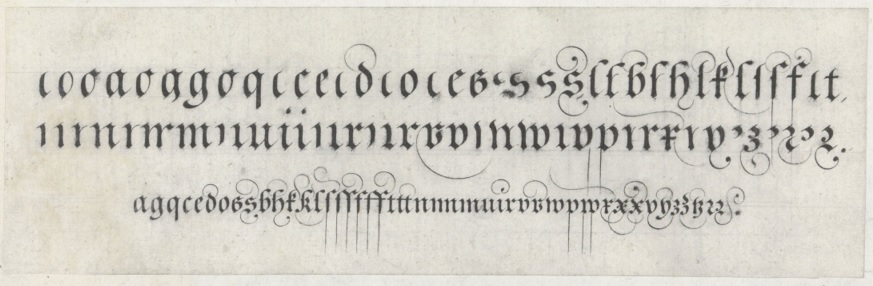
Now
to come to the teaching of the Italian hand, I shall give notice of
each letter, and what letters take the origin of another, all this
contained under three principals: o, ,i & f from which all others
spring, why I will also first clarify how to make them.
|
|
|
|
|
|
|
|
|
|
|
|
|
o
|
The
o I start with the right angle of the pen, pull the thumb a little so
that the pen begins to descend to the left hand, flat down, then
turning to the right hand, before moving it across upwards, to the
beginning of the o create and close it.
|
|
|
|
|
|
|
Make the top and bottom equally wide, which is for the sake of her grace.
|
|
|
|
|
|
|
On
which the letter o has most the whole body of the Italian hand and is
founded, as well as all the other letters, is the shape of the oval.
|
|
|
|
|
|
|
|
|
|
|
|
|
i
|
The
i is made from a straight down line but is started with a small fine
line made the the edge of the pen or the side of the pen, and ends with
the right angle of the pen by making a small outline in the same way as
that of the o.
|
|
|
|
|
|
|
|
|
|
|
|
|
|
This letter also has a large share in the body, as we will prove next.
|
|
|
|
|
|
|
|
|
|
|
|
|
f
|
The
f is also no less powerful, being the one from which all the members'
lines projecting below and above the body take their origin.
|
|
|
|
|
|
|
She
is started with a good angle of the pen, in the manner of a little
curve line, and then reversing, I then join the line to make her head
with a little elongated stroke.
|
|
|
|
|
|
|
Falling
down there to the second part of her length, I draw the pen to the left
hand (which is one third) and make a little scrap at her tail or to
continue with a return to the right hand, sharply projecting, etc.
|
|
|
|
|
|
|
|
|
|
|
|
|
|
From
what three letters, as vivid origins of all others, we can explain the
form of each letter alone, beginning from the a to the last letter of
the ABC.
|
|
|
|
|
|
|
|
|
|
|
|
|
a
|
The
a, the first letter of the alphabet, is made from the o and the i, and
draws the i with a straight line against the right side of the o.
|
|
|
|
|
|
|
|
|
|
|
|
|
b
|
The b takes its being from the two upper parts of the f, already makes its belly in a sweep upwards in the same way as the o.
|
|
|
|
|
|
|
|
|
|
|
|
|
c
|
The
c I start with a little scrap like the head of the f but not so big and
make her body even as if to make an a, and finally in the inversion I
fly the pen sharply upwards.
|
|
|
|
|
|
|
|
|
|
|
|
|
d
|
The
d is also made partly from the o and from the f, I start as if I want
to make an a and come from diagonally above descending downwards as if
I were thinking of making an l, and end like an a.
|
|
|
|
|
|
|
|
|
|
|
|
|
e
|
The
e I start with the right corner of the pen and turn it to the left hand
to make the head, turn the pen down into the flat and end her body as
the c.
|
|
|
|
|
|
|
|
|
|
|
|
|
f
|
The
f has no other difference from the f than the little line which I draw
with the edge of the pen right through the body itself, sometimes its
shape is changed by the different heads and tails given to it, which
are three.
|
|
|
|
|
|
|
The
first retains its shape from the f, the second has made the straight
from a bicycle kick to the right hand with the flat of the pen softly
disappearing, the third has the head and tail made with an inversion,
whatever lines be used with all other letters whose members protrude
above and below, such as b d h k l p q.
|
|
|
|
|
|
|
They are most commonly used in running hands, as they give the most speed and are very elegant.
|
|
|
|
|
|
|
|
|
|
|
|
|
g
|
The
g is made from the o and from the last two parts of the f hanging over
the top of the o's head, and draw out her tail with an upward sharp
line with a lightness to the bottom of the o
|
|
|
|
|
|
|
|
|
|
|
|
|
h
|
The
h is made in the manner of the , and has no other difference than that
its body is open at the bottom and that of the b is closed.
|
|
|
|
|
|
|
It is also being changed in various ways as can be seen in the foundations.
|
|
|
|
|
|
|
|
|
|
|
|
|
k
|
Although
the Italians and the French do not use k, I have nevertheless also
wanted to describe its form, because one or the other, of whatever
quality it may be, must be satisfied.
|
|
|
|
|
|
|
She
is made of the f, begin her head like the head of the c and come out
with the cut of the pen in the middle of her body, turn with the flat
towards the right hand going obliquely downwards, and make her street a
slightly bent, it ends with a sharp swipe with the edge of the pen.
|
|
|
|
|
|
|
|
|
|
|
|
|
l
|
The l also takes its shape from the two upper parts of the f.
|
|
|
|
|
|
|
It
is made with a drop to the left hand and from there to the right,
ending with a small line approaching the edge of the pen that rises a
little.
|
|
|
|
|
|
|
|
|
|
|
|
|
m
|
The
m is made of three legs, like the i, which are lightly tied together in
one movement without lifting the pen, floating upwards with the pen's
end over the first leg, and falling round with the pen's flat to to
make the second leg, and so also the third which I finish like the t.
|
|
|
|
|
|
|
|
|
|
|
|
|
n
|
The n is made from the first and third leg of the m.
|
|
|
|
|
|
|
|
|
|
|
|
|
p
|
The
p of the two lower parts of the f, part of the o, but is equal to the i
with a small line drawn at the right angle of the pen.
|
|
|
|
|
|
|
It is changed like the tail, as I have treated before, and the body is sometimes made of a round r.
|
|
|
|
|
|
|
|
|
|
|
|
|
q
|
The
q is made from the o and the f, just like the g, and is no different
except for its tail, which comes in three forms, as I mentioned before.
|
|
|
|
|
|
|
|
|
|
|
|
|
r
|
There
are two types of the r, the first is made from the n and like the i is
taken with a small line from the edge of the pen, after that is done
you will pull the pen straight down and then go up again from there to
the two parts of the body, with the right angle side of the pen to make
the head, and give a little nudge with the flat of the pen at the end.
|
|
|
|
|
|
|
The other r is taken from the o, namely from the upper and lower part.
|
|
|
|
|
|
|
I
start from the top with a bicycle kick, then with the right angle of
the oen move slightly upwards and then slant down to the left hand
until half the body, then I turn the pen in the flat back to the right
hand , and let her fly out sharply on the same side.
|
|
|
|
|
|
|
|
|
|
|
|
|
s
|
The
little s is also made from the upper and lower parts of the o, but
opposite to the r, for as the r is drawn down from above to the left
hand, so in contrast this s is drawn from above with the flat from the
pen to the right hand drawn down obliquely, make her head with a small
inversion, and so going down to the right hand, turn the pen to the
left hand to make her tail, which is done with a nudge in the back of
the oen, once so big as the head is.
|
|
|
|
|
|
|
Two
ss are joined together, cut the first part with the edge of the pen
straight through her body upwards to engage the head of the second,
which is also done with an inversion through the body itself.
|
|
|
|
|
|
|
This
s is also tied to the p and the t with a line going up from her head,
there making a loop twice as high as her body is long, and then
reversing from there on the right side of the pen down to the p and t
are binding as can be seen from the following distribution.
|
|
|
|
|
|
|
|
|
|
|
|
|
t
|
The t also takes its essence from the i, it is lengthened by a fourth and, like the f, has its body cut transversely.
|
|
|
|
|
|
|
|
|
|
|
|
|
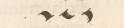
v
|
We have two kinds of the v and the u, the first is a consonant and is placed at the beginning of a word.
|
|
|
|
|
|
|
It
takes its origin from the o, I make of the v two elongated commas, the
first I take down from above and without taking the pen from the paper
I bring the other down upwards with the edge of the pen, which I close
with the back of the pen with a slight push.
|
|
|
|
|
|
|
|
|
|
|
|
|
|
From
the consonant v the w is made in the same way, I attach it to the top
of the head of the same first v and make it equal in breadth and
length, just as the other letters of the same shape have equal width,
length and curves to give it more grace.
|
|
|
|
|
|
|
|
|
|
|
|
|
u
|
The
other u is a vowel and is made of two ii tied together, get the tail of
the first into the center of the body to grasp the other.
|
|
|
|
|
|
|
|
|
|
|
|
|
x
|
I make the x like a pitcher, slanted across.
|
|
|
|
|
|
|
I
start it with the big side of the pen, and later turning the same on
the flat, draw from the left hand down to the right, then I start the
second line as I also make the head of the c, thus cutting through the
first line in half with a good angle of the pen, turning and twisting
at the end as I make the tail of the little s.
|
|
|
|
|
|
|
|
|
|
|
|
|
y
|
The y springs forth from the x, differing only in this that the crotch is cut off in half by her tail.
|
|
|
|
|
|
|
I
start like the first line of the x, then ink comes up, make her head
like the c, and descend with the cut of the pe to the left hand next to
the first line, and make her tail in several ways similar to the tail
of the f.
|
|
|
|
|
|
|
|
|
|
|
|
|
|
The
y is also made in another way, binding two tasks together, viz: I come
from below the first task upwards, and sprouting above almost at the
end with the edge of the pen, get it in the flat a little bent across
for the second task, and end it with the tail of the first y.
|
|
|
|
|
|
|
|
|
|
|
|
|
z
|
The
z takes its position from the last y, the first task going down I make
at the end of the second, excluding the tail, a little curved line of
the same decency as that which the two tasks of the y garnered together.
|
|
|
|
|
|
|
|
|
|
|
|
|
|
This
undertaking of each letter in particular I have wished to describe, for
the common good and good will, and for the greater elucidation of my
teachings, to put together the foundations according to their proper
origin of the Italian letters.
|
|
|
|
|
|
|
Not
making the arrangement according to that of the alphabet, but an
arrangement of all the letters together which take their essence from a
similar origin.
|
|
|
|
|
|
|
As
also of the identical letters, which are made in different ways and
hung together with several lines from above, as can be seen in the last
tile of the accompanying engraving.
|
|
|
|
|
|
|
|
|
|
|
|
|
|
Have
had several experiences of the inexperienced overwriting many letters
two or three times when a line should do so, resulting in you not going
as fast as you should, and obscuring the liveliness, I thought well of
pointing out which letters with one line and which must be made with
two lines.
|
|
|
|
|
|
|
The ones made with one line are these: a b c e g h i l m n o q r s v u z.
|
|
|
|
|
|
|
And the ones made with two lines are these: d f k p t x y.
|
|
|
|
|
|
|
In
a similar way I have also added here the letters which are started in
the same way, with a small line with the edge of the pen, starting from
the left hand to the right going diagonally upwards as well as those
that end in any way with a small stroke, drawn with the right angle of
the pen.
|
|
|
|
|
|
|
The ones that start the same are these: i m n p r u x y z.
|
|
|
|
|
|
|
And those who end in the same manner are these: a c d e i k l m n t u.
|
|
|
|
|
|
|
I would like to put these details here, all for the promotion of beauty and the help of those who procession the pen.
|
|
|
|
|
|
|
|
|
|
|
|
|
|
To this must be added the explanations and teachings of the capital letters, which are called Capitals or Majecules.
|
|
|
|
|
|
|
but
as this work has already fallen so heavily, and I do not like to burden
myself with copious reason to use the same matter, considering that
they too, for the most part, take their origin from the o and the f,
therefore I have wanted to omit them, leaving it for a better
opportunity,
|
|
|
|
|
|
|
|
|
|
|
|
|
|
In
the meantime I would like to ask the art lovers and beginners to make
do with the Capitals as mentioned, assuring me that from the same
instruction as before it can be sufficiently understood how the Italian
letter can be made large and small starting and ending, as well as by
what rules and degree one must keep, to be able to write perfectly with
the same hand.
|
|
|
|
|
|
|
|
|
|
|
|
|
|
Education of the large and small Dutch letters.
|
|
|
|
|
|
|
|
|
|
|
|
|
|
... |
|
|
|
|
|
|
|
|
|
|
|
|
|
Instruction of the Textur Letter.
|
|
|
|
|
|
|
|
|
|
|
|
|
|

|
|
|
|
|
|
|
|
|
|
|
|
|
|
Coming from the teaching of Dutch letters, I shall now begin with the Textur letter, which is probably the oldest of the Grove and Bastard letters.
|
|
|
|
|
|
|
It has been in general use among the religious who have written the sacred legends and Masses in such a letter.
|
|
|
|
|
|
|
She
is made in various ways: some pressing close together, with a thickness
of one-eighteenth of her length, others a little further apart, and
somewhat thicker, namely, the same part of her length, which also
pleases me worse than the thin narrow one, whereas in it a better
measure can be preserved and it has a better standing.
|
|
|
|
|
|
|
The Perpendicularen line is the one that makes most of her body, because her stance is usually elongated.
|
|
|
|
|
|
|
Her
head and feet are usually made elongated and squared out, beginning and
ending either below or above, with the edge or flat of the pen.
|
|
|
|
|
|
|
Some
hang heads and feet together, and some don't, which I also consider
better because they look cleaner and are easier to read.
|
|
|
|
|
|
|
The
lines that run across the body are drawn half the width of the pen,
starting from the right hand to the left, always matching the heads of
the further letters as you can see in the examples.
|
|
|
|
|
|
|
|
|
|
|
|
|
|
Fracture letter instruction.
|
|
|
|
|
|
|
|
|
|
|
|
|
|
|
|
|
|
|
|
|
|
|
|
|
|
|
|
The Fracture letter has evolved from the High German, where it is also used because it is more beautiful and graceful than the Texture and also because it is easier and faster to write.
|
|
|
|
|
|
|
The
High Germans usually write rather boldly and sharply as they do with
all their writings, which are usually written with a thick pen, and
disdain all thin writings whose body and limbs are equally thick and so
scraped as if they had tuberculosis.
|
|
|
|
|
|
|
And,
to tell the truth, there is nothing more graceful and more agreeable
than a well-posed body, that is, a little bold writing and a little
subtlety on the cutting edge.
|
|
|
|
|
|
|
This Fracture
letter has no difference other than that the heads are drawn with a
stroke, firstly they start with the edge of the pen and end with the
flat , again starting with the flatt and ending with the edge, because
unlike the Texture the heads
are made elongated and flattened, and that the feet of the mm and the
nn below should be square like a rhombus, and some others a little
roundish, in the manner of the semi-stretched round elines, indicated
above in the figures, and still have other feet in the way of curved
diamonds, as you can see in the examples.
|
|
|
|
|
|
|
|
|
|
|
|
|
|
Instruction of the Bastard letter.
|
|
|
|
|
|
|
|
|
|
|
|
|
|

|
|
|
|
|
|
|
|
|
|
|
|
|
|
This Bastard letter has a completely different character than the Fracture letter, although those who have practiced the Fracture letter a lot will also be able to write the Bastard letter, because it is also written almost the same way except that one has to make the body rounder and squarer.
|
|
|
|
|
|
|
The
looking letters should be flat on top and headless, although Scribes
also make them with a head for the sake of giving them some change.
|
|
|
|
|
|
|
The semi-curved round lines are the ones from which most letters, which are lacy round, are made.
|
|
|
|
|
|
|
The Perpendicular
line for all letters that go straight down and whose feet touch curved
diamonds, except those of the hh ff mm and nn, which have no feet but
must be blunt and flat below.
|
|
|
|
|
|
|
I make her limbs as long as the body, except for the d and the t, which above the line should only look half her length.
|
|
|
|
|
|
|
You may measure and seek the position of its thickness and breadth from the following foundations.
|
|
|
|
|
|
|
There are other ways of writing coarse letters, both
High German and Dutch, which are called Cantzellery writings, lying and
oblique, but as I have said only want to deal with the particular and
most common (although without insisting on that I could impart to
enthusiasts all sorts that six books wouldn't be enough to understand
it all). |
|
|
|
|
|
|
I shall continue with our general Dutch letters, to describe her stature and qualities according to the gift I have been given. |
|
|
|
|
|
|
|
|
|
|
|
|
|
Department of general Dutch letters.
|
|
|
|
|
|
|
|
|
|
|
|
|
|
... |
|
|
|
|
|
|
|
|
|
|
|
|
|
French letter instruction.
|
|
|
|
|
|
|
|
|
|
|
|
|
|
... |
|
|
|
|
|
|
|
|
|
|
|
|
|
English letter instruction.
|
|
|
|
|
|
|
|
|
|
|
|
|
|
... |
|
|
|
|
|
|
|
|
|
|
|
|
|
Instruction of the High German letter.
|
|
|
|
|
|
|
|
|
|
|
|
|
|

|
|
|
|
|
|
|
|
|
|
|
|
|
|
It
remains to speak a little about the High German hands, which I wanted
to deal with last because they differ most from our letters, although
they are not the worst.
|
|
|
|
|
|
|
For
as the Fracture is well regarded, small and great, and then also the
Canzzelery in various ways with its Lines and Capitals, so it must be
confessed that these have no less ornament and grace than those of the
other Nations.
|
|
|
|
|
|
|
And the importance of the general High German hands, as well as no less pleasing, as useful and skillful to master quickly.
|
|
|
|
|
|
|
Pleasant
I say because they are plump and well fed, and able to lead the way,
because this letter falls round and short, and is well connected, so
that it must be rolling and speeding along.
|
|
|
|
|
|
|
The most important are the Round and the Curente hand, of which the Round is the most beautiful.
|
|
|
|
|
|
|
They
do not differ much from each other, except that the Round is written
somewhat shorter in body, and that it falls backwards, as opposed to
the curente, and is therefore also written with various kinds of pens,
as I have explained before.
|
|
|
|
|
|
|
|
|
|
|
|
|
|
There are even more types of High German writings.
|
|
|
|
|
|
|
But
in order not to overload the memory and understanding of the novices
with too much confusion of various ways, I have only included here the
nature and fundamentals of these two.
|
|
|
|
|
|
|
From
which experience one can easily arrive at the manners of all others,
consisting most of the changes in the variety of the n m, for as the
High German masters themselves write: VVie manncherley m / so vil
artenschriftenn (so many mm's, so many artful writings).
|
|
|
|
|
|
|
|
|
|
|
|
|
|
As
several aficionados have seen some parts of my books, made them think
that some Capitals which are in the beginning of Matter might be a bit
too much for those who are first beginning to study the art of writing
to pursue after her, I have thought it right to add these Dutch,
Italian and Spanish capital letters to the conclusion and end of this
book.
|
|
|
|
|
|
|
So
that the novices and students should have no cause of impediment, to
sail well at the beginning, and to come to their good will and to write
well and perfectly.
|
|
|
|
|
|
|
|
|
|
|
|
|
|

|
|
|
|
|
|
|
|
|
|
|
|
|
|
The
others who are a little more adept at the actions of the pen and who
are eager to progress, and who do not yet feel they are good enough,
will be allowed to practice in the preceding Capitals, as well as in my
exalted poems.
|
|
|
|
|
|
|
Which,
though not according to the order of the ABC, yet I have put forward,
for those who will write Matter books in such a way, may find therein
the whole ABC, none of it omitted, but made up to the z, yes, nearly
two or three of each letter, which I did to satisfy every one, and lest
I should be accused of not having wrought as much for the one as for
the other.
|
|
|
|
|
|
|
I
beseech all pen-lovers to thank my work, and to do more my goodwill and
affection which I have had, but which Mr. Poormoney has prevented,
though he has lent my hand in this work liberally, and that my book
costs me great expense, and I myself end with difficulty and in great
poverty, but:
|
|
|
|
|
|
|
Like a woman, after she has given birth,
The pain forgets, when she sits at rest:
The labor also, which has weighed me down,
To bring forth, this work in its right nature,
Now that it's done, I've forgotten most of it.
FINIS
|
|
|
|
|
|
|
|
|
|
|
|
|
|

|
|
|
|
|
|
|
2023 - Bach Museum Leipzig
|
|
|
|
|
|
|
|
|
|
|
|
|
|
Back to B
|
|
|
|
|
|
|
|
|
|
|
|
|
|
|
|
|
|
|
|
|
|
|
|
|
|
|
|
|
|
|
|
|
|
|
|
|
|
|
|
|
|
|
|
|
|


