
A few bites have been taken from an apple - of the tree of everything, the good, the bad and the beautiful.
BWV 651 is a long instrumental fantasy based on a chorale, the second stanza is asking for protection against false teaching.
A fruitful remedy might be to ask yourself: "What am I seeing?"
When you start to change the way you look at things, from a calligraphy point of view, the things you look at change.
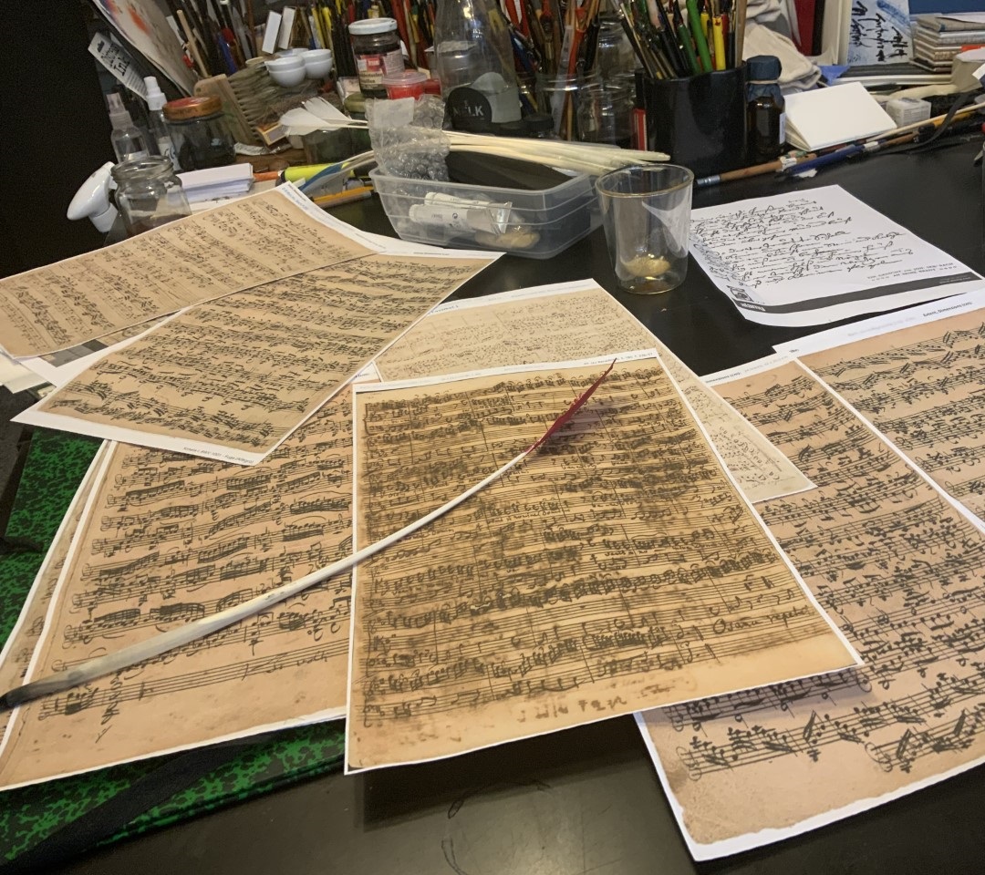
I have often been surprised afterwards how quickly special tools, types of paper and ink suddenly appeared on the table in the middle of a conversation, to feel and look at. Many times during the learning process I had to adjust my beliefs, a humbling experience that was overshadowed by the thrill of seeing and understanding something.
Seeing a painting for the first time in real life that you only know well from reproductions, can be an overwhelming experience because of its size alone. Size matters. It is instructive to print the digital scans of scores at actual size and to crop blank parts. The analog world is informative.
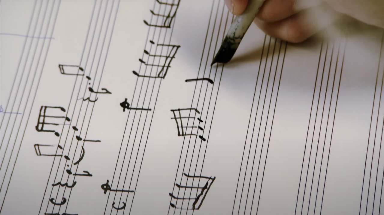
The movie which documents the false theory shows half a minute of calligraphing.
Although the cello pieces copied by Anna Magdalena are the subject, we see copying of opening notes from the autograph by Johann Sebastian Bach of the first prelude of the Well Tempered Clavier.
We can make a few observations:
- no specific features of Anna Magdalena's handwriting are mentioned or copied, allthough they are at the core of the substantiation
- the placement of the quill is vertical (180 degrees) without change, in Anna Magdalena's and Johann Sebastian Bach's handwriting this is for text 40 degrees and for music 90 degrees
- the line thickness is the same everywhere, with the Bachs it varies according to function
- efficient use of limited space is lacking
- staff lines are printed instead of handwritten
- the bleached, thin paper has a very fine grain
- the lines are uncertain and searching, as if they don't know where to start, heading to or where to end
- the commentary voice mentions that the only difference from writing with a pen is the frequently necessary re-dipping
- after copying a few notes after the Bach example, the attention does not return to the autograph, but a simplified version (heads in line form) of sixteenth notes without bar context begins, like a partly fallback to a more primitive Palaeolithic layout.
There are some acted scenes where Anna Magdalena is doing calligraphy:
- she's left-handed
- the different feathers she uses all still have their barbs complete, which can be seen in many movies, but certainly is not appropriate in a case like this.
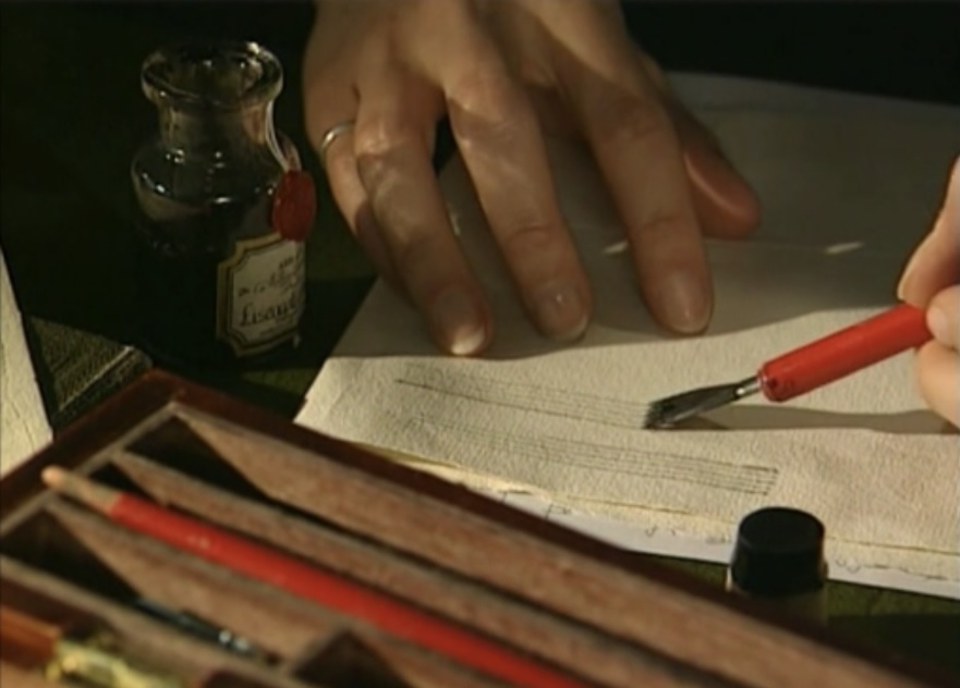
Under the bumpy sheet are other papers, which influence grip and direction. The moving images show that the hand moves slowly instead of with a smooth movement.
The paper is directly in front of the writer, instead of at an angle, which makes it difficult to draw a straight line.
The size of the paper differs from the folio size that Bach usually used. Many of his staff lines are about twenty centimetres long, fueled by one dip. In this film, the first staff line is about half that size.
The inkwell, immediately next to the right hand, shows a label from Abraxes original oak gall ink, made on ancient recipe of best raw materials.
This film focuses on the preservation of Bach's handwriting. Generally in a storyline, insight through imitation often lies between praise for the aesthetics of Bach's writing and highly sophisticated research techniques.
The copying does not seem experienced - it suggests that there is an undeveloped research area. Knowledge of calligraphy and knowledge of music seem to be separate areas without much exchange. While it should be a startingpoint.

On the website Bach Digital the complete score can be viewed. It preceeds with a Trio by Friedemann. His handwriting can be clearly distinguished from his father, it is firm. He has his own visional vocabulaire and habits. The smaller, lighter, more dancing writing is from Sebastian.
On the lower staff line of this fragment you can see that some of the stems of the notes point to the right. This is Friedemann's hand. You can tell from beams (and his lettering elsewhere) that he wrote right-handed. You could assume that he was sitting to his father's right, because quite a few stems go from left to right. However, he also does this when sitting alone at a table.
Friedemann sometimes lets the stems fall apart like a fan, from left to right, upright, to right to left, very characteristic and idiosyncratic. Perhaps he was left-handed by nature and that's why he had a tendency to make these turns.
It could be that left-handed people who were forced to write with the right hand, had the freedom to switch hands in musical notation. We don't see that happening here.

On pages where only some of the bottom staff lines are not used, you can get an indication of the amount of freehand filled breaks in the note-filled ones.
In addition and to take also into account, lower staff lines are often messier than the above, and sometimes try to compensate in successive attempts for skewed previous ones.
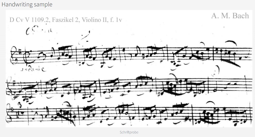
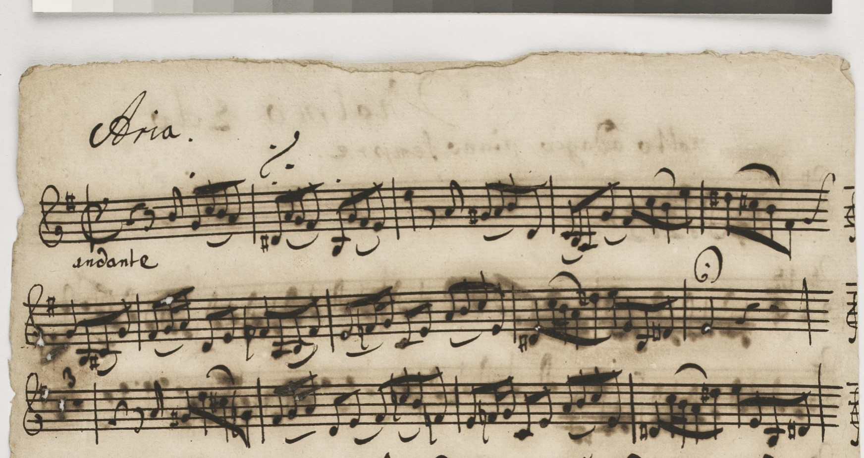
It is also striking that the left margin in the first sample has been cut off: not included as a relevant feature.
How do we explain this? My two cents: the black and white image is more in line with the modern uniform notations, the Urtexts, with their contemporary spelling and clefs, and their objective scholarly representations. Just a guess, it's a weird riddle.

Even if they are not, we can see the contemporary form of another couple: there are two inkwells on the table, which has a cloth. A third couple accompanied tall Magdalena, she had a rather small lap dog, and Sebastian, he owned a rather large satyr.
The satyr is known for his lust for wine, they let instinct over reason, anarchy over order, ecstasy over asceticism, abundance over temperance. During the Renaissance and beyond, satyrs were often confused with the goat-like Pan, the hero of BWV 201.
Ink was cheap, coffee was expensive, as we can see from the luxurious coffee pot on a richly decorated tray a table away. Inkwells were sometimes also richly decorated, but as a common utensil most of them were simple. Two inkwells: one for the brown and black colors and a second one for the red. Judging by the shape, there was a small inkwell in a wide round holder, on which a cap could be put.
BWV 211 Liesgen: "If I'm not allowed to drink my cup of coffee three times a day, I'll turn into a withered piece of goat meat to my sorrow".
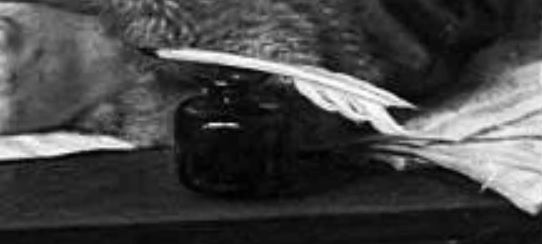
Imagine Bach turning his forearm forward, it would protrude over the tabletop, insufficient to rest a folio on, which is therefore rotated a quarter turn - this table foreshortening is a compositional choice by the painter. Multiple focal points and foreshortening are traditional artifices from an experienced painter's toolbox. The tabletop has the fabric look of oak.
A quill is resting op the top of an inkwell, it has a cut barb, and the black nib tells how deep it was dipped. The positioning of the quill is motivated with the viewer in mind, we see what Bach could have seen.
The painting is an attempt to portray specific facts more than a quarter of a century later. The shiny glow on the inkwell suggested glass, which was like the clothes an anachronistic modernization. Glass inkwells existed for millenia, but were exceptional, stoneware was normal. We also see small tin or lead pots on still lifes, they have the advantage that they do not break as quickly as glass or earthenware, and are also relatively heavy so that they do not fall over easily.
Its low center of gravity would keep it from tipping over quickly, but it is perilously close to the edge, as is this representation of Bach at work, or maybe it is better to conclude that it has fallen into the abyss of what can be known.

Bach had hardly started on a new folio when his inkwell fell over, while the aria text speaks of an accident. Instead of taking another sheet, Bach writes neatly around the large blot.
The position of deckle edge on the left and fold on the right show you at a glance that it is a verso side. A folded paper yields four folios, three of which were already written on. Bach described the last side while the first folio at the right side was visible, unfolded.
The
inkwell was at the top left of the page and nearly empty. He had to dip
his quill deep into what was left of the walnut ink to dip. When he
pulled it up, he abruptly twisted the jar to his right side and it
tumbled.
That is at least one of the possible scenarios. It's hard to imagine an inkwell tipping over, they are made not to, with a low center of gravity. Murphy's law states that anything that can go wrong will go wrong. A risky moment is refilling the inkwell, but that also usually went well. Perhaps he used an unsuitable inkwell for a moment, as he also sometimes lost his rastrum, as we can see here and there on staff lines drawn entirely by hand.
On the engraving we can see a two-part inkwell, perhaps the pottery of the holder was of poor quality, and that is why Bach used only the small unstable pot for a while, with all the associated risks. Discarded pottery in old cesspools and wells could provide clues as to whether this could be the case. Many engravings with images of writing pots also give a good impression, for example this one.As this was not the first time this had happened, and as we shall see not the last, we might suppose that Bach prefered the daredevil choice of removing the little inkwell from its holder. Maybe it was made of heavy metal like lead, and that's why he thought it would go well with the well.
His
table might have been almost perpendicular. Almost: the ink slanted
slightly to the
lower left. The left table leg was slightly shorter or the floor was
not quite parallel, moving in opposite direction as the gently sloping
street at his front door. This observation is not certain, the shape
can be entirely attributed to the force of overturning, as has been
tested by us experimentally.
The
ink
spot has a width of 9 millimeters at the top of the page, which might
have roughly corresponded to the opening of his inkwell. The
distance from the inkwell to the paper was greater than it's height.
The ink
did not run on the other side of the sheet, as
sometimes happened to one of his regular copyists Johann Andreas
Kuhnau, who occasionally got very messy. Quite dramatic was the smearing of his copied parts for tenor and bass of BWV 70. Another example is BWV 24, a cantata with the title Ein ungefärbt Gemüte: an uncolored spirit, which he managed to give some color. Kuhnau's
Rorschach butterflies do not show the same angle of inclination as
Bach's. The outsourced work of copying the individual voices by
reliable copyists maybe did not happen at the same table, Bach's
composing space was his alone.
The stain was initially not
as big as it got. The paper absorbed the water, swelled, and gave it a
push, leaving behind lighter-colored areas. Or maybe he tried to limit
the damage by partly dabbing it up. Sand was apparently not available,
suggesting a scenario where his ink set was momentarely lost. An ink
set was often two-part, like a salt and pepper set, for ink and
absorbing sand. The many smears of flowing ink on his scores indicate
that use of sand was not a habit of his.
Amazingly,
notes on the sheet that tell of an accident weren't hit, they weren't
hurt, no accident ever hurts the kid and his music. Jesu Juva is
working.
In the Upper Palaeolithic Proto-writing System the Y-symbol represented birth, having a child. Figurative images were combined with stickman and abstract counting symbols that are all about creation.
We tend to recognize figurative images in clouds, and rudimentary abstract ones in star groups. Bach used that mechanism as a source of inspiration when choosing his motifs, which regularly incorporate audible and visual representations. This folio resembles clouds and stars, with a grayscale inversion. It's an accident illustrating an accident, a joke with the wit of Saul Steinberg, juxtapositioning diverse styles and meanings.
The thundercloud is a striking summary of the essence of the whole cantata, an elementary theme reduced in a single image, just as in its musical subjects, kein Unfall, it is what it is not. A ceci n'est pas une pipe Erlebnis for Bach, watching the ink dry and contentedly lighting his tobacco pipe.
Coincidence played a part in the example above, chance illustrating impending fate visually. Bach the artist liked it, was happy and choose to keep it that way. The Bob Ross in Bach made a little friend out of a silly mistake, created order out of chaos, wrote two rests at the fourth and fifth staflines following the arc of the spot, and connected note and blob with a slur.

The stain has an even gray value. Sand may have been sprinkled over it to absorb the ink.

Brown ink is not waterproof, the liquid partially dissolved some notes, the dye followed the path of the foot. The circle may have been formed many years after the music was written.
The wet foot of a drinking glass or an inkwell was 7 centimeters in diameter. Perhaps it was the JSB monogrammed crystal goblet he might have been given by the Krebs brothers in the late '30s. On the glass there is visual and musical wordplay on the meaning of Crab (Krebs in german).
This is an intensively used score, many pages are well-thumbed.

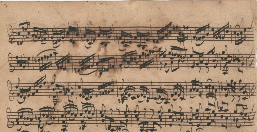
This sheet music is from 1720, when Bach lived in Köthen. Some tumbled inkwells are from his Leipzig years. In all cases, gravity manifested itself speciesally, to the lower left. You can assume that Bach moved his work table from Köthen to Leipzig.
His regular and main copyist Johann Andreas Kuhnau could have sat at the same table on a few occasions, like: BWV 135.


In visualization, we should exercise some restraint when it comes to projecting our own personality onto that of others, when we interpret what we cc.
This dripper is not a stroke of the pen, this early Jackson Pollock could be of a completely different date, and life is not a comic book.

This is 1749, the same working desk might still be in good service.
Bach does not have long to live here and would loose sight soon. There are scores in the last decade in which the handwriting seems to have deteriorated. But look here how powerful his writing is, equivalent to his happy years in Köthen. Awesome.

Filling the inkwell has been combined with trimming the feather, which has been given a wider nib. When resuming, some brown notes are overwritten with black. The quill was roughly cut and adjusted again for the second part of this allemande. One barline was accidentally converted into a graphical representation of a feather, chance illustrating the hassle with tools.

The brown ink of staff lines that can be seen here has not been used in the cantata, which is written in black. Afterwards, Bach may have found it no problem to let use a title page as scrap paper. It is also possible that one of his copyists used the neat front page as a draft page, some staff lines of individual parts are set in brown.
What also argues against Bach's own hand is that he usually does not extend his staff lines all the way to the edges. The question is whether he himself used a draft page.
The simplest solution to prevent a mess is of course not to extend the staff lines all the way to the edges, which was out of manageable control for many.

The writing ink ran out and he solved that by diluting it. He used the wide bottom margin to write in organ tablature music that doesn't fit on the staff lines. His staff lines are thin and in light ink, it is hard to imagine that they can be read in moonlight. His writing has been an influential example for the young Sebastiann.
When his brother died in 1721, Sebastian inherited his manuscripts and it would have been a confrontation with his early caligraphy.
Christoph's cleanliness is comparable to Carl Philipp Emanuel's in some periods, spotless and under control. In Emanuel's case, not the first thing you might expect from his Sturm und Drang art, a style of composition that communicates emotions of stress, fear, horror, and anxiety. Calligraphy style and music style can be two completely different worlds. Good to realize that, for example when you have a tendency to see a psychological portrait in it.
The calm neatness of Johann Christoph's writing, the general absence of mistakes, the respect, love and understanding for the music it expresses, he emerges as a living person. If it has no psychological logic, then it's still a manifestation of who he was.


The same area was also used as a base when punching holes to bind the pages. Kind of a battlefield.

When Sebastina's son Wilhelm Friedemann turned ten, he was given a book with blank pages for writing and music lessons.
Sebastian must have been able to copy a lot from his brother for his calligraphy lessons. He saw his brother set up a page like this. It is an excellently executed task, freehand, with optimum control over page layout, carefully and clearly chosen margins, and beautiful dark ink.
Johan Christoph's vast music collections show a refined taste and a sharp eye for artistically interesting pieces. They also testify to a well-functioning selective network, resulting in an eagle's eye view of what was worthwhile.

Johann Sebastian Bach did not have this kind of urge or natural interested in doing something like this, there is a lot of remarkable visual poetry to be found in his scores, but that occupies a different scope.

The evenness of the lines is also striking, the pressure has not been too light or too heavy. The ink has been able to flow smoothly without being profuse. There is a color difference between staff lines and notes, but the difference in gray value is not so great that it is emphatically present, an optimal and smart contrast for readability. Well-balanced walnut staff, gallus notes against a flax background, nice and excellently done.
This kind of clarity moves towards our modern digital scores and is a far cry from the looseness and aesthetics of Bach's hand.
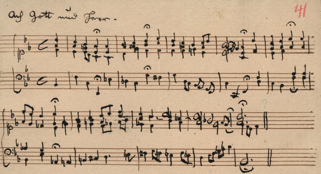
Emanuel's
musical notation at this time, on the other hand, looks cramped, and may be an
indication
why he didn't write staff lines freehand.
Short stems, instability of
direction of writing, shaky letters, unconnected curly brace of the
first two staff, tiny key signatures: they tell of impaired motor
skills and physical distress.
The chorale is a verse of the song Ach Gott und Herr, wie groß und schwer by Martin Rutilius (1550-1618). Provided with poignant harmonies by his father, with new text, for BWV 48: punishment and pain follow sin. This was personal and cruel.


Extra bar lines have been added to the right, the existing horizontal demarcation was not sufficient, according to him. Or he judged the empty space that happened to him because he overlook it in advance, as too big. Wide margins right and left, right less than left. Much of what is written is slightly but consistently unbalanced, stems, barlines, numbers, in the opposite direction of the angle of letters, minus against plus 5 degrees. The page layout therefore gives the impression of a zigzag movement. The figure four at the time signature has been given a quarter note as an illustration, double information that is slightly confusing.
Characteristic is therefore the double way in which the same information is communicated: grouping, time signature, end of bar. Communicating visibly benefits from economic single minded clarity, there is already enough to process.
You could say there is a lot of visual noise here, unnecessary to much information for the reader, distracting contrast and resounding line, and very present help for the writer.

The way our body's work tend to make an upward pointing arc shape. At the start it is easy to place the rastrum perpendicular to the blade. When drawing the lines to the other side of the page, over a distance of about twenty-one centimetres, the hand makes a small twist, which is difficult to correct and compensate, which explains the slanted finish.
Determining the width of a used rastrum should be measured at the beginning of the lines, it is narrower when the tool is slightly tilted.
The first two bifolios have 25 staff lines, there is no regularity in their positioning, so there is a large mutual variation in top and bottom margins.

It is therefore advisable to let the rastrum rest on a wet cloth before use. Or to first make a few strips on a piece of scrap paper. It is not the pressure on the pen or the posture, but the rastrum that needs to be worked in.
The problem was solved by Bach by turning the page upside down. Things go wrong are instructive for how things go right.
There is a bar with a restart after dipping the pen. Only two lines were drawn, at the new beginning it's all five. The renewed bet is slightly slanted in an attempt to match the earlier lines.
This folio is the first page of a cantata. In this case Bach first made the staff lines when he started writing down the cantata, there was no stack of paper with staff lines ready. It dates from the year 1736, the time when he composed a weekly cantata was behind him, there was less benefit to be gained from pre-processed pages.
Also note that a sheet of paper was once folded into four folios and because of the necessary drying time, strategic planning is necessary for the order of making the staff lines.


The extra horizontal line through the third digit six in this fragment is there for the sake of readability. Fixing meant drawing a thin horizontal line, in order to do that, the quill had to be set at a special angle, or the paper had to be turned one turn. Judging by the instability of such lines, changing the direction of the quill was usually chosen.
The color of the paper is still attractive, without rust, it doesn't seems to have aged much. The black ink does not seem to have caused damage to the paper. The colour of the surface is fresh, this must have been soot ink.

The pressure on the five nibs is irregularly distributed, there are imperfections in the flowing ink, the lines are not mathematically straight, but slightly wavy. The top nib of this rastrum is bent outwards, so that the distance between the top two lines is greater than that of the others. The irregular distances between the lines form an individual characteristic that allows us to connect different scores in time. The weak metal and intensive use make it likely that they did not last very long.


A steel rastrum of later date, not available to Bach, does not tend to smear lines.


"Nothing is more regrettable than the fact that Bach, due to his eye disease and subsequent death, was prevented from completing his work himself and making it available to us. He was surprised by his own death, which struck him when he was in the middle of completing his last fugue, in which he introduced himself by his own name." - Carl Phillipp Emanuel Bach
Some differences between this folio and the four previous ones:
- the sheet was folded
- the staff lines are freehand with start and end margins
- their is an empty staff between two written double staff
- the ink is bistre instead of soot
- the brownisch ink did not react to the chiffon silk like the soot based ink
- the rastrum used on the first four folios has no regular spacing between the nibs
- the color of the staffl lines is different
- a watery brown ink stain has spread to the lower left
- a different quill was used for writing the notes
- the paper is less yellowed, there are far fewer hemp fibers to distinguish, and the blue colored, indigo by woad, recycled rags are also missing
- there are pencil numbering and bar line extensions
It has been suggested that Bach cut off the sketch on this folio because the lower staff lines are flawed. That was of course already visible at the start, and he could have written down quite a few following bars without any problems. You could also say, he was already tired when he used his rastrum for this folio, and stopped with the notes because it was enough for the day.
The page is 33.5 centimeters wide, drawing straight stave lines over such a distance deviated from what Bach was used to. A ruler was therefore used on the four earlier folios. The rastrum was not placed against the ruler, small waves are detectable, because the contacting fragile tip must be able to spread a little to allow the ink to flow, you can also let your hand be guided by the straight board. Those pages has the layout of examples for the engraver. It was therefore intended that this fugue would be part of the engraved edition of The Art of the Fugue.
No pencil was used as in the first test with the engraver. That turned out by experiment to have no added value.
Besides the music and the oblong layout and size, there is not much that connects these folio's together. From a calligraphic point of view, you could say that a sketch sheet and neat elaboration have been brought together, but were originally separate from each other, and document different periods in its origin history.
For the dramatic incompleteness, we could rather look in the incomplete surviving history of Bach's handwritten scores. The rough enumeration that has been drawn up of all available scores with the inheritance, the clearing of what could be disposed of, sketches and preparatory works have a difficult time in such a period, the difficulty of being able to oversee them, the distribution thereof between the heirs, the survival history of the split works.


Each note of the six-part harmony has been given its own stem, individual voices share beams in a complex display of spacial arrangement.The note heads are therefore not completely vertically lined, but shift slightly to the right.

Above the recitativo is an aria for soprano and she sings in between: "ignore all limitations".
Up there again on the same pages is the opening chorus which begins with the phrase: "Let's care, let's watch" - with the melody descending on care and rising on watch.
This sheet is designed with twenty staff lines. Twelve stafflines for the opening chorus, five for the aria and two for the recitativo, one left blanc.
In calligraphy there is a rule about 'keeping register', fitting exactly over each other.
Monks managed to get lines in the same place on every page by poking small holes with a needle.
In this secular cantata, Bach not only chose to put different parts on a folio, but also had the music continue from left to right on the folded page. He ignored the limitiations of the fold. He was able to keep good register at the top staff line, just on sight and without the help of a tiny hole. At the bottom staff line he missed the straight path. He took care of it by connecting de staffs manually.
At bar level, Bach's sense of proportionality and balance is unsurpassedly masterful. But his stafflines do not keep register, he didn't care and we can see Bach was comfortable with that.
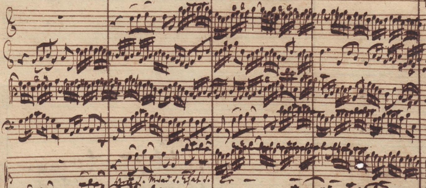
The line thickness of the bar lines is not the same as that of the staff lines, nor equal to the X-width of the notes. A quill tip is specially cut to pull these verticals. The color of the ink of the bar lines corresponds to that of the staff lines, the musical notation is slightly darker.
So extra tools are needed to set up a page in this way: a ruler and a specially cut nib. In addition, there is the disadvantage of prescribed dimensions. An advantage is that it makes counting the number of bars easy.

The still wet ink of bar lines from another page has acted as a stamp, slicing up and further dividing an already split mind.

It may of course happen that you forget the name of the composer of this music. In that case you can count the number of pages of this collection: 41 in total. That number is equal to the number sum of Bach's name: J.S. Bach 41 (9+18+14). Or you can look at the last bar of this fugue, which when you convert the notes into numbers (A=1, B=2, ..., Fis=33, etc.) has a total of 158, which is equal to the numerical value of the full name Johann Sebastiann Bach. Self-manifestation with the means of a sophisticated playing graffiti artist.
Bach also manifests his name and dominion on a large scale. The pieces for solo violin have a total bar count of 2400. The duo pieces BWV 1014 - 1019 for violin and harpsichord also count 2400 measures. There is also proportionality within smaller groups. For example, the first solo sonata has a total of 272 measures, and the total of its first three movements is equal to the fourth final movement. A one to one proportionalism which he loved, believed in and can be traced everywhere in his art.
We can check out how this incredible mastery is reflected in visual proportionality, planning and communication.
The preceding adagio of the first sonata is on a page with 11 staff lines and with a large bottom margin. The number of staff lines per page is adjusted to the size of the piece. The fugue has 94 bars.With 24 staff lines, that should fit two folios with four bars per staff line. Indeed, the first staff line spans four measures.
With the second staff line, the bars become wider because more sixteenth notes are composed. Of bar eight, only the first quarter unit is noted on the second staff line. The hierarchical relationship between strong and weak beats within a bar now spans several staff lines.The spacing between the notes is kept even. This spacing calls for a total of 26 staff lines divided over two folios. The ratio between measure and staff line turns out to be 3.6 instead of the previously estimated 3.9.
After bar 88, a special solution is chosen, the free space of the bottom margin is utilized by adding an extra staff line on both folios. The extra added staff line on the first folio does not begin at the far left of the page, but has a very wide left margin, a visual marker of the special intervention and layout.
If you make a copy of this fugue, you can estimate that you need 26 staff lines for two folios. But that is not what Anna Magdalena concludes in 1725. Her enormous talent, skill and ability to copy Bach's handwriting does not include overview of the music. Anna Magdalena chooses to use the small rastrum for the lower staff lines, drops the wider margin (also with the other staff lines there are no left and right margins) and sticks with the reshuffeld order. While an improvement by taking a good look at the layout planning is obvious.
There has been no verbal one to one coordination to prevent and adjust her way of copying. Like,
Leipzig - 1725
"Lieber Taube, this is a nice opportunity to fix the 3.6 bar staff ratio and sequence of measures."
"Du bist selbst eine fette Taube, you know that the factor determing the length of a measure is the number of notes within it, and that number varies."
"Aber Schatz, you don't have to reinvent the wheel, you can see that 26 staffs are needed."
"Der Topf, der den Kessel schwarz nennt, look at yourself, I mean, your score, Taube."
"Liebling, Taube, I know it's hard to estimate the total space needed in advance, and choose the right size and constant spacing, that is why I always use a large bottom margin, if my calculated estimate does not come out completely, I can move to that, I don't blame you, you're doing a great job."
This is one example, but it is systematic. Amazing. For Bach, it did not detract from the quality of the copy, this was acceptable and well.
There is something restricted and mechanical in Anna Magdalena's copying, yet it is also enviably free and swinging.
The sense of proportionality and numerology that Bach demonstrated with mathematical and playfull precision in his music has no visual equivalent counterpart in his calligraphy, which is rather carefree and loose.

Although it concerns instrumental music, chorales are quoted. The ciaconna closes in d-minor with the Easter chorale "Christ Jesus Lay in Death's Strong Bands". The adagio starts with the Pentecost chorale "Come, Holy Ghost, God and Lord" in C major.
Bach had used the Easter choral motive before in BWV 4, in the duet for soprano and alto over the words: 'the death, the death".
In 1720 Bach's first wife Maria Barbara Bach died, her name has the numerological value of 95. Those numbers 1720 and 95 can be traced several times throughout the work. The music is a personal memorial, a tombeau.
Valuing deciphering this meaning takes a different context when you realise that the chorals were very well known. Not knowing what the referrenced words are does however not mean that we are diconnected to the artistic and emotional impact. The music speaks universally and personally without words.
But knowing the context helps understanding why and how two different pieces appear here on the same page.

ANTEATER: “Have you ever noticed how in these pieces the prelude always sets the mood perfectly for the following fugue?”
Between prelude and fugue calligrapher Douglas R. Hofstadter made an illustration.
It can be read as REDUCTIONISM, HOLISM or MU - depending on the level of observation. (The letter M consist of the word Holism, which letters are formed by the word Reductionism, which letters are made by the letters MU.)
Reductionism stands for: a whole can be understood completely if you understand its parts, and the nature of their sum.
Holism means the whole is greater than the sum of its parts.
Mu(sic) rejects the premises that one or the other must be chosen.
ACHILLES: “I am a little confused.”
Prelude and double fugue 19 are constructed around the chorale " Oh head, full of blood and wounds / O Haupt voll Blut und Wunden".
Bach will later use that melody as the main Leitmotiv in the St Matthew Passion.
It also appears in six cantatas, the Christmas Oratorio and as a separate chorale.
The chorale text does not seem to fit the happy mood of prelude and fugue 19.
Perhaps Bach had the original text by Paul Gerhardt of the melody in mind: “My mind is confused, that makes a virgin tender / Mein G’müt ist mir verwirret, das macht ein Jungfrau zart.”
(Several chorales by Paul Gerhardt are quoted in Bach's solo violin pieces.)
The older text is an acrostic: it gives the name MARIA in the first letters of the stanzas.
The words can be understood both in the sense of the worldly love for a girl with this name, but also in the spiritual sense for the Blessed Mother Mary.
CRAB: “It's a shame I didn't have you over to meet her last week.”
BWV 864 Prelude & Fugue were composed around the same time as the solo violin pieces.
Where the violin music is a dance of the/her death, might this prelude and fugue couple lay out a celebration of (her) life. This version brings as much comfort, there were happy times and memories.
Collage artist Johann Sebastian Bach quotes melodies and words of colleagues like a winking modernist. We can suffer from fear of missing the complete picture of references by numbering and to chorales. To accommodate that it is rewarding and fulfilling to know biographies and secondary literature. They offer the puzzle in highly personal and general context and will reflect much what Bach has integrated in his art.

There are two hands to guide the way along the complex final passage contained in the bottom margins of two folios. Barlines connecting two staves are alternated with loose short ones. The writing becomes more compact to have enough space.
Pages 1 and 2 have a royal bottom margin, on folio 2 recto the top left margin contains page numbers 2, 3 with strikethrough and 4 in pencil.


The cover title (Musicalisches spelled with a c!) and assignment text is set in moveable type using the Fraktur script, and the music is engraved, both in oil-based ink. The acrostic was done by hand with a quill, Latin words in standing Roman script using water-based ink, a black bistre. This line must have been a later idea.
In the first draft, Bach wrote the word Regis with royal alignment, becoming more and more squat towards the end of the sentence. The last word exceeds the border of the impression the copper plate has made for the music on the other side. The letters are written with the utmost care. The second version is more regular, but there is some cutting and pasting of paper involved.
The Offer also contains Latin phrases that invite to research ("Quaerendo Invenietis" - You will find by seeking) and recall extra-musical topics ("Ascendenteque Modulatione Ascendat Gloria Regis" - May the Glory of the King Ascend as the Modulations), titles that contain Latin and Greek, and clefs that are both upside down and back to front.
Bach had two hundred copies printed, which he mainly gave to friends free of charge.

The idea of using guides for top and bottom of letters may have been inspired by the technique of engraver Johann Georg Schübler, who even signed the last copper plate.

Bach and his son Wilhelm Friedemann chose and revised this prelude, among other pieces, to make a good impression at the application of Friedemann in 1733 in Dresden. Friedemann added the words: per manum Autoris in the score. Crashing into the right side border was here solved by writing the last letters top down. Coping and addressing a problem when you run into trouble is also part of your personal layout style. Don't get caught up in judgment, simply notice the unexpected and embrace it.

Kuhnau's capital D and the left margin occupy one third of the width of the page, on the right the space with the lowercase t is one sixty-fifth. The second line with its uppercase N and lowercase d is a repetition of this sort of format. Generous left margins and a crash on the right are common page layouts.
The flax paper is high in fiber, but one of the dark lines may be an eyelash instead of grass fiber. A person loses an average of one to five eyelashes per day. The time that Bach spent on calligraphy of his scores runs into the years. Thousands of lashes have fallen on it, a few may have made it to our time and place. (The papermakers will also have dropped a lot of everything into the pulp.)

The last two letters of the word "Verba" are lined vertically, crashing against a border is most likely to happen at 3/4 of the total concentration span needed for a job to be done.

Bach's musical calligraphy is as magnificent as his music.
Cantata parts were often written under great pressure. There was no time to make a carefully calligraphed version. You can tell from the writing that it was written quickly, in the bars above this fragment note passages cross bar lines. Yet there are many details in this type of manuscript that are among the most beautiful of his handwriting.
When he slows down a bit, stems straight, fully focused on composing, and his choices when writing are based entirely on experience and muscle memory. This is calligraphy at its peak. The classification and dichotomy between Gebrauchsschrift and Kalligraphy that is used in Bach literature is meaningless and distorting. This example could be classified as Gebrauchsschrift because of its properties, but the appreciation implied by the term Calligraphy fits better here.
The surefire lines, the swung, the individuality of the noteheads, the proportionalism.
Breathtaking, unbelievable, awesome.
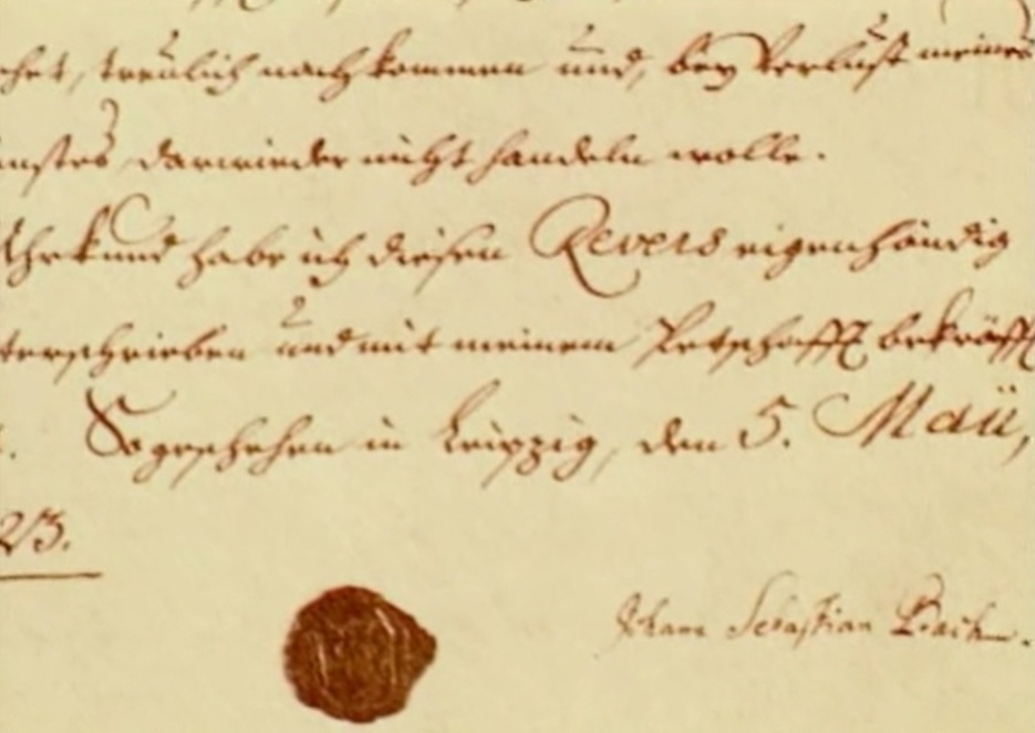
How beautiful is this writing, the well-placed ornamentation, the wonderful balanced ratio between the x-width of the quill and lettering, the height of the decorations and curls, the spacing between the lines, the variation and change in proportian of the French words to Roman script. Tastefull, clarity, creativity. Phenomenal, confident craftsmanship casually applied with pleasure. This man knew what he was doing.
Two hands, it is a pity that the mediocre signature with its wobbly horizontally placed letters, random embellishments and size detracts somewhat from the masterful handwriting above it. It is the contract signed by Bach for his appointment at the St. Thomas School.
Bach had a private secretary for writing his letters, only a few letters in his own hand have survived. His sentences are as polyphonic as his music. Musical notes are held together by harmony, which is lacking in his prose, so that we bounce back and forth between different thoughts, which makes them difficult to follow and understand. Rephrasing a Bach sentence and doing justice to its content is a challenge.
We could understand the exposed submissiveness as belonging to his time, but there are also letter writers who do not allow themselves to be characterized by it.


"Son tres-humble & tres obeissant Serviteur" - his very humble and very obedient servant.
Understandable and normal in the historical context, such were the social relations. Plain weird from our point of view.

The connection is so smooth that we can assume that Bach outsourced this to a bookbinder. If you are doing something like this yourself for the first time, you will not easily come up with the idea of sanding the thickness of the sheets at an angle behorehand.
The joint is so perfect that it allowed drawing stafflines with a rastrum unhindered, that is craftmanship for sure. It was as smooth as the pumice-sanded connecting edges of a millennia-old papurus scroll. The bookbinder knew that, Bach did not: on the first page the staff lines are still very patiently drawn with a clever drawing strategy, with small strokes, a careful exploration of what is possible.
After glueing, the sheets will have been clamped to allow them to dry evenly. Just the right pressure has been applied, the surfaces has not been pressed too high at the joint. High pressed writing paper will become standard a century later, allowing speeding up as with many things.
Some stress is visible on the right sheet, directly next to the connection. It could be an indication of the accident that had happened. Swelling due to water, which in turn may have been used to extinguish fire. But it might as well have just been an irregularity of the paper itself.

Where the rastrum lines of the two bars on the left go up slightly, a result of our natural tendency to draw a line from the wrist, we see a slight drop to the bottom right in the restored continuation, a result of fatigue. When we get tired, we collapse.
The darker coloring of the brown ink on the right is enhanced by the color of the paper.


It could of course also have been the other way around, that he was able to see how it should be done during the restoration and then started applying it himself.
The Oboe papers glued together are not first beveled by sanding.
The viola part would not have been able to stand very stable on a music stand with its folding construction.


Blotting paper was not a local product, it came from Japan, it is very thin, super strong but it does have a direction where it can be easily torn straight. Bach must have passed this expensive product through his fingers in amazement, feeling how flexible and resilient it is. You can pull it hard, it is remarkably elastic.


These actions are time-bound in terms of technique and use of materials, and thus document survival history.


The lower margin of the fugue has a stave that goes over the two foilos. Four sixteenths written across the fold tell that there is also a portion missing that was originally in between.
A fold is a weakening of the paper, which can eventually fail. When making a copy, you want the part to be copied to be close to your paper. You'd rather not place them partially on top of each other, sometimes the ink didn't dry properly, and it's difficult to keep that risc in view. That is why it is sometimes useful to fold the original sheet in the opposite direction. A double weakening, which will make itself felt in the long run.
Bach's score is bound, the bifolios are next to each other. Anna Magdalena's copy has series of three folded bifolios, another organization that has led to a lot of leafing while copying.

Bach's writing style here is already a lot looser than that of his older brother Johann Christoph: BWV 724. On the other hand, Christoph is very free and creative in graphic decorations, such as in the closing curls.
Bach earliest handwritings are organ tablatures, dating from 1700, with pieces by Buxtehude and Reinken.


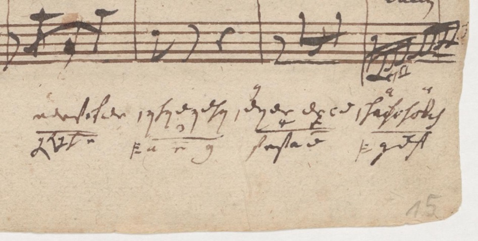
The margins of Bach's scores are a very special area where wondrous things, breadcrumbs, entire universes take place. The area can be used if there is need for additional staff. It can document the moment and first appearance of a musical incursion, unrelated to the music above.
Bach can switch to his beautiful organ tablature script here, sometimes for practical reasons because no staff lines are needed, or because it is a script that came easily to him, a true feast for the calligrapher.


At the bottom left, names of some notes have been written, again in pencil.

Corner parts tend to collect all kinds of page counts at the top, another drift, now born from the need to create overview and order. Here in red ink and pencil. When Bach numbered pages, that meant the entire sheet of four folios when cantates are concerned. Not really convenient and inviting to other counts.
Also conceivable is the urge to number each individual bars, as happened in this score later in pencil after Bach. He did not have that need.
An advantage of bar counts is not only that you can use it during rehearsals, but also helps you not to skip measures when copying, or quickly notice when or scan where you actually did.

Handwriting experts who have to make their judgment about authenticity in legal disputes often rely on their experience, and rightly so, a lot of looking leads to expertise. Their verbal substantiation is of a different order, often limited to a few obvious characteristics, some feel about the layout and the certainty that people never deviate from what they always do. That can be quicksand.
In Mozart's opera Don Giovanni the servant Leporello sings a "list Aria": a catalogue of all the ladies loved by his master, to Donna Elvira, who then realizes she is only one of over a thousand. Libretist Lorenza de Ponte invented a new word for her at the start of Leporello's lyrics: "Madamina" - tragidly folded out of two words Madame and Signorina, which she isn't both, stressing her uniqueness.
Bach's handwriting spans half a century and has changed over time.
Art historians like regularity, artists like change, trying things out, searching. Rembrandt's Man with the Golden Helmet, one of his finest works, has been written off because the focus is not on the face but on an object. The unsurpassed masterful technique "could possibly have been produced by several unnamed copyists." Vermeer's lovely Girl with the Flute has been written off because a different setup than usual was used. You can of course distinguish different hands by applying the technique used as a criterion. But people with a creative inquiring mind don't always play by the rules, even not their own.
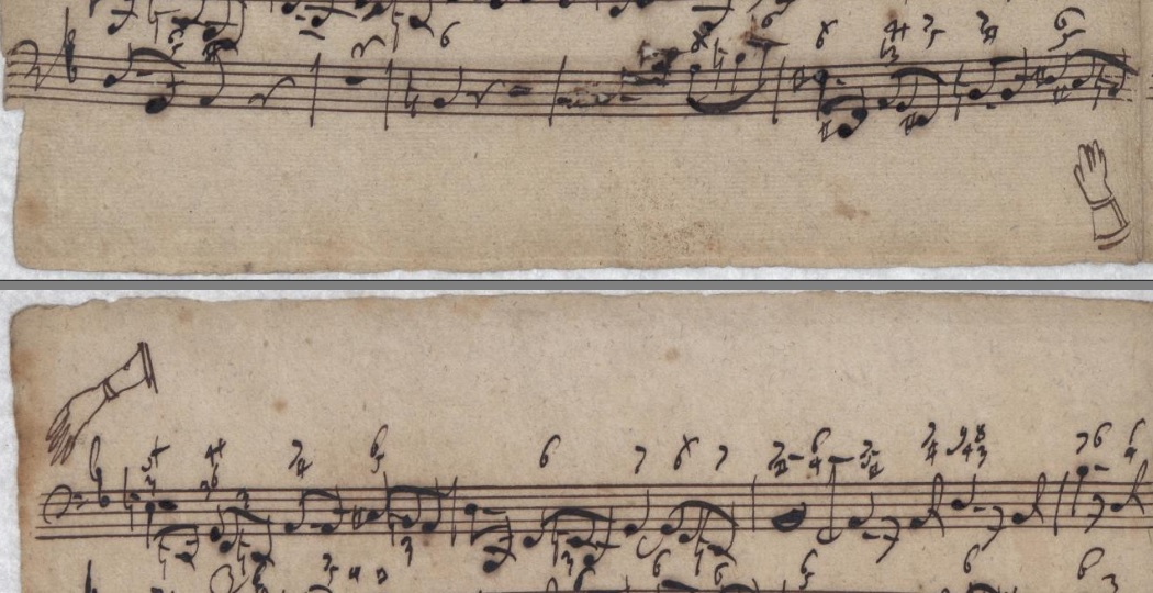


How should we understand the use of a pencil in this context? Three months earlier, Bach had moved to Leipzig with his family and household goods on four fully loaded carriages. He immediately set to work on his long-cherished wish to compose a volume of cantata cycles, a cantata for every week and special occasions. He gave the very best of his ability.
Before realization, he must have had a vague idea of which creative possibilities could all be worked out in the course of a year. Things went very smoothly, the first quarter he delivered high quality music. He could look back with satisfaction on what he had achieved so far. Yet he may also have noticed that not everyone could participate in the complex set-up. This is the context where the idea for the chorale cantatas might have been born.
Earlier cantatas ended with a chorale, but the inventiveness of the new set-up was to integrate it into his new music in all the parts. So not just a surprising and in-depth harmonization of a well-known melody at the end, but a participation all along that could seduce an overwhelmed listener, so that he did not drop out.
For us, the pencil is an obvious sketching tool. At the time of Bach it was a very modern and unusual writing tool that had not yet been fully developed. There were no gradations in the graphite. The ratio between hardness and gray value was different than with our pencils. It was manual work to make pencils, they will not all have been the same.
The beauty of a pencil is that you can very well not be precise with it. That makes it so suitable for sketching. You can set up your first lines very lightly. You see the result and go over it again, but now with adjustments and slightly darker or more accentuated lines. You keep going until you are satisfied or something has become clear how to do something, or you start again with another idea.
The pencil is therefore extremely suitable for visualizing and supporting the different phases of the artistic process. That is a completely different tool than quill and ink.
If you can play the piano well, it does not automatically mean that you can also play the violin well. You are actually back to square one. It takes effort to reach the same level - practice, patience, understanding. That process is fueled by progress, and progress is fueled by progress.
The potential benefits of using a pencil were apparent to Bach. He tried every now and then. The results were not good. The grayscale of the pencil was too light, it wore too quickly, it was both too soft and too hard: a sharp sharpening made a furrow in the paper.
Bach was very well trained to write a composition in its entirety right away. Occasionally he tries to use the pencil, but he has never succeeded in using it effectively and systematically.
The light pencil marks have sometimes prompted later owners of the manuscripts to trace them again, again in pencil or ink. When judging whether a pencil line is original or a later addition, the sketchy character and light gray value are good relevant criteria.

In this movement, Bach has also used his small-tipped quill for voices that he partly wrote with his other, broader quill. Alle Welt (everyone) is portrayed with as many notes as possible. For the concertante accompaniment of the chorale melody, with joyful motives in sixteenth notes, this small script suited and fitted better.
For the beams of the sketched melody, Bach turned his hand to the standard position for text: 40 degrees. Crashing into the right margin is here solved by resuming in the staff above and a guiding line.


A freshly cut quill was tested on the last staff, with stems slanted to the right (Bach's testing is connected to this charateristic, excluding them from notes to be read), and the wet ink was then smeared: "my desire, where can I find you? Must I lose you so soon?".

Biographer Martin Falck wrote that the portrait represents Johann Sebastian Bach: “ähnlich dem profile seines Vaters”. This qualification has not been taken over in Bach literature. There are many authorities who think something, clever ones who point out uncertainty of what is knowable, but in this case unspoken prejudices against children work might be a heavy decisive.
There is a possibly that this is one of the very rare portraits of Johann Sebastian Bach made directly from observation.
The sketches might not be caricatures, the intention may well have been to be as accurate as possible. The lines have a searching character, the portrait on the right could be a retry with more attention.
The thick lines are a result of the notebook being slammed shut before the ink was dry. A mirror print is left on the other page. (Reality playing a Bacchian trick.)
The young Friedemann wrote: "Meine Liebe" - my love, in beautiful calligraphy in the left margin, with the script rotated a quarter turn. Two ostentatious capitals seems to be undergoing a metamorphosis as a preliminary stage of the two portraits, who themselves are like a young boy with his father standing behind him.
The folio is speckled with blotches that have held back discoloration, maybe a result of bursting out laughing and launching small droplets with a neutralizing pH value. Paper is equipped for recording sounds in many ways.

You can see all art as a (self) portrait - that is not to state that Friedemann imagined and drew himself as an old man. Although some aspiring draftsmen have a persistent and surprisingly striking tendency to characterize themselves in portraits of others, a mirrored outcome of certain well established dominant synapse connections of how your face, a face is structured. In this case it can be simpler: the son is like his father, the father is like his son, the older you get the more you become aware of the resemblance to your parents, which has more to do with perspective and observation than with changes in similarity.
Friedemann possibly captured common family traits of the Bach family, with its fleshy heads and characteristic profiles. Observing, groping for exact proportioning instead of jesting and doodling around. During singing lessons and rehearsals in the Thomasschool there will have been plenty of opportunities to imagine yourself temporarily unobserved and to waste time drawing.
Of all Bach's sons, Friedemann's art most resembles his father's, he remained faithful to the style and his father wrote much music for Friedemann's education. Many of Bach's autographs may have been lost to the unfortunate fate of his eldest son, but they were both deeply connected in a loving relationship.
Friedemann's sketch is missing from the line-up of usual suspects of authentic Bach portraits. But it certainly deserves its place. It's not a photorealistic likeness, and appreciating sketch lines can be a hurdle. A teenager may try everything with his quill to experience an effect, to entertain the mind and killing time, for a good laugh while testing the power of words and lines.
“You are a good little boy” - wrote Johann Sebastian Bach on a tiny folio for his eldest and most talented son Wilhelm Friedemann, who cherished those words. The sweet note got missing a century ago when descendants of Friedemann lost a suitcase, during a moving to Chicago in the previous century.

The sketch is placed in the middle of the page, further elaboration was not intended here. The survival rate of sketches is low, here it has hitched a ride on the score of other music. They are very valuable for the study of Bach's composing method.
Deest comes from the Latin deessum and means to miss, in combination with BWV it means that it concerns music by Bach that does not have a BWV number


A whole lot of trouble here in this fragment, faced with a couple of strategies. The problem was the clogged bottom staff lines and stuttering ink at the top.
Water was dripped on it, which went its own way and created a Cambrian fossil, a Triops bacchus bavariensis (Dreyauge in German, the species name was coined in Bavaria, Triops only hatch after the eggs have been in contact with water and are sold as kids toys).
A scrape has been attempted, with the curved back of a quill knife, giving the beast its third eye and even a backbone. Some lines are partly drawn by hand again. The choir sings: "Hilfe!! Hilfe!" - help, help!
This was a lot of out of focus distraction for a bar where the music is silent.


Children's drawings have a very low survival rate, this is something special. We can distinguish staves and bar lines, and the gesture of the connecting brace of the double stave. Smart observaces, nicely executed with available motor skills. The spontaneity of the lines testify to vitality, unhampered by contemplative uncertainty. That's a quality that we necessarily lose as we get older, and it takes a lot of mindful effort to get it back.
The subject is exceptional, no mummy and daddy stick mans en basic geometric figures resembling home, but complicated writing, becoming familiar with musical notation at an early age.
If we assume that this was one of Bach's children, then we have a point of reference for Bach's use of red crayon, and a basis for distinguishing its use on scores after his demise. Colour, placements, degree of coverage and lines are relevant criteria to distinguish them from additions after 1750.


It is not easy not to show an extensive display of these kind of phantoms here, because of their intriguing beauty and documentation of thoughts - errors and alternative not worked out or objected options.

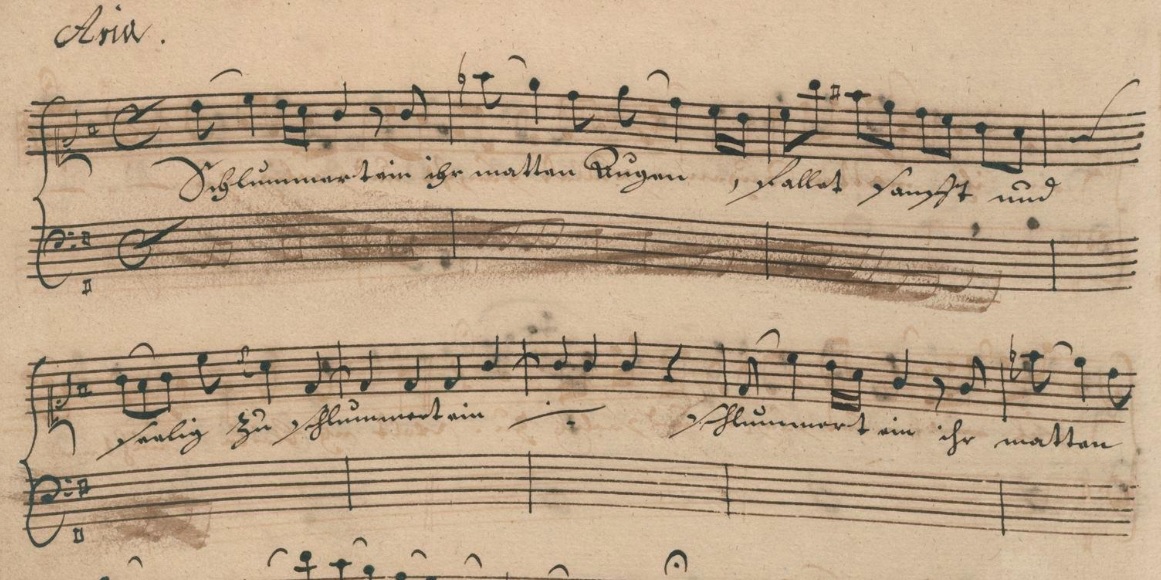
Anna Magdalena must have sung this lullaby over and over again, and from the accompaniment we may conclude it only took four bars to sing to her children to doze them off.
The title page of this notenbook in the hand of Anna Magdalena shows wiped doodling of pen trials, belonging to this category, to be stored in our library of movements.


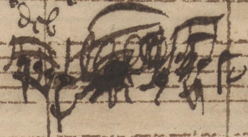


Music and lightning override each other in this dark passage, both should be read and heard.
The word Blitz: lightning is stricked through musical notes depicting a lightning.


Pencils nowadays have a code that refers to the hardness of the lead. At first glance, I estimate Bach's to be an F which stands for firm or fine point. Later hands are more in the B grades, with a blacker and grittier line.
Text in faded red ink can also just be seen in this fragment. The second X in red seems to be crayon.
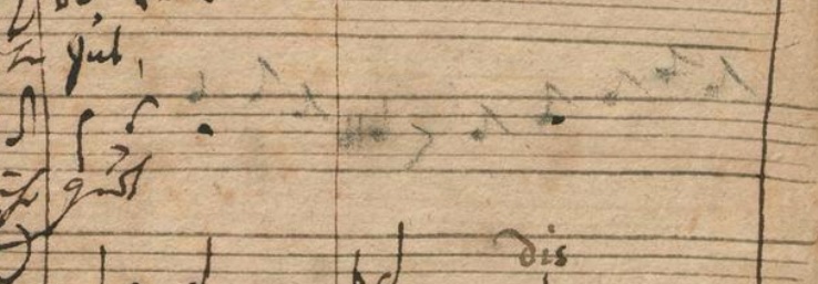
The actions of pencil writing seem to follow those of the quill gesture to some extent. But a pencil behaves differently, resulting in an imperfectly searching and probing beginner's writing.

A half note became a pond that Bach rubbed out with his finger, which became a stamp in the same bar. After completing this cantata, his hands must have been covered in ink stains.
After the bar on the left, the pencil was sharpened. The autographs have a long history of ownership and some have allowed themselves to write on them. Missing or unclear pagination has tempted many people to number in pencil.
Bach added in some cases missing accidentals in pencil. To distinguish his pencil writing from that of later owners, we may consider the degree of coverage of the graphite as a relevant characteristic.
Second beams are separate from the first, not connected to a stem. That differs from writing with a quill. The stems are thin and the beams are wider, the pencil tip appears sharpened like a feather point. In use, the position of the quill is also followed. That's a smart strategy to try, but it doesn't do justice to the character of the pencil. A pencil nib changes shape quickly while writing. You can see the stems becoming ticker within one bar.
The pencil melody is a variantion to the choral which at the time was thought to be composed by Hans Sachs, the historical famous Meistersinger. It is the first elaboration of the concept of weaving well-known chorales into a cantata, a fertile and ingeniuos idea that would dominate the entire cantata volumes of 1724 and '25.
Ingenious in that it connected listeners who were familiar with the chorale melody from childhood with special musical affects, it was a familiar and innovative experience at the same time. A sensation that passes us by because we have not sung the chorales over and over since childhood, but for his audience and listeners it must have been a great effect that made a deep impression.
That fantastic concept has been given a graphical mark here.
Charles Rosen, the godfather of musical analysis, published a book about Music and Sentiment in 2010. One chapter describes Bach's music. Some quotes:
“The works that escape the unity of sentiment are those that give the impression of improvisation, like toccata or fantasy."
"Formally constructed pieces, however were subject to the requirement of a single affect. In Bach's music a formal piece was a rhythmic continuum with an unstoppable drive to the final cadence."
"Bach remains unchanged affectively throughout except for nuances of intensity."
"It is true that the variations are so significant that we might like to claim that the sentiment has altered as the work proceeds, but there is no place where we can draw a line to differentiate one affect from another."
"The technique of representing an affect does not essentially differ from that used in his most complex constructions."
"One exception can be seen in the opening chorus of the Passion with the superimpositions of a chorale tune over the main body of the chorus, a procedure parallel to the double fugue, with two motifs of contrasting character."
"The technique demands that both motifs be eventually sounded together if not at once, and the basic affect that determines the unity is the of combination of the two motifs.”
I would like to draw a couple of pencil lines.
The works that escape the unity of sentiment are also complex formally constructed pieces - as many cantata opening pieces testify.
Take, for example, the opening of BWV 69, a double fugue with contrasting themes: exuberant coloratura versus modest humility. The first worked out in an extremely strict form, the second more freely with unexpected combinations of vocalists and instrumentalists.
There is a thin line between double fugues and fugues with fixed counterpoint. Fixed counterpoint contrasts as much as possible with the subject in rhythmic and motivic sense.
Bach's music is not propelled by a rapid succession of mood swings as in the Classical Style. But in the Well Tempered Clavier successive parts do have dramatic contrast.
The godfather of musicology declaring in 2010 that Bach has interwoven a contrasting chorale in only one exception evokes in me a range of disunited sentiments: amazement, bewilderment, irritation, sadness, anger, contempt, disbelief.
BWV 78 Meine Seele: Bach assimilates choral fantasy, church song, motet, concerto, ritornello, chaconne and sarabande in one magisterial piece with a broad range of sentiments. Depicting the paradox that suffering is a liberating joy.
BWV 25 Meinem Leibe: Bach shows how a gloomy and desperate atmosphere is overshadowed by the prospect of redemption.
BWV 39 Dein Brot: Bach at the peak of his ability depicts lines with many musical word paintings without falling into a structureless sequence of pieces.
BWV 524 Hochzeits-Quodlibet: involves simultaneously sounding (fragments of) different texts sometimes far from comical or light-hearted.
BWV 101 Bach's version of Picasso's Guernica. Relentless modern dissonances with a hammer motif based on the chorale The Ten Commandments and a sighing motif set against an old-fashioned melodious motet in Renaissance style. A symphony of destruction, medieval terror evoke the image of a desperate human plea that resounds from the desolate landscape of a ruined city. Rarely performed, metaphor for the end times, judgment day.

Bach scores are rich in this kind of visual poetry.
This is the first Leipzig cantata in which Bach does not borrow text from the Bible, but from free poetry. The unknown poet in this case wants to direct attention from the earthly to the higher. The music dramatizes the contradictions between fear and hope and between concern and comfort. This alternation suggests that we should consider cantata parts 1-3 as a whole. We also see this in the layout, the parts do not start on a new page or line, but connect to each other.
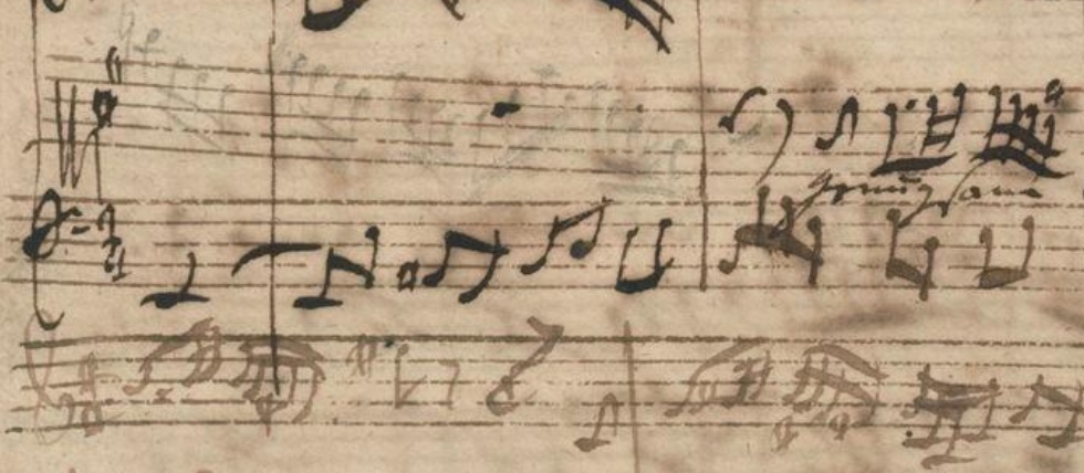
The connection between stems and beams is often imperfect in pencil. There is no variation in horizontal and vertical line thickness. The placement of the noteheads in the spacing of a bar is less accurate, the ratio between spacing and width does not seem right.
With the light opacity of the pencil in this fragment you might think that it was partly erased with bread.
Instead of refilling his inkwell, Bach has chosen on this page to add a good splash of water to his ink, which then became very light. We can see from the light clef that he did not first fill his page with clefs and accidentals, but did so by group of voices. Such a difference in ink color also tells a lot about the order in which he wrote down the votes. An insightful peek into the kitchen.

The graphite has been rubbed at the end, it seems unknown that this works well with bread. Judging by the writing, Heinrich himself tried out the pencil there.


The violin melody depicts a seductively swaying, writhing serpent while the other voices rhythmically hack at the beast until its head rolls and lays corrected.
There are other pieces in which the melody moves in a similar way, but which have nothing to do with a snake. But in this cantate he clearly lisps, squeezes and squirms himself verbally out of the apple notebook.
Bach's talented private students remained in his company for several years, some adopting many of the powerful features of his handwriting. Kayser is a good example of this, an excellent musician and observer. Another pupil showing the same development is Christoph Friedrich
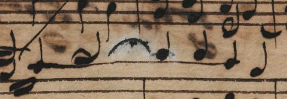
Johann Nicolaus Schober made a copy of the cello suites. In the Gigue of the second a bar is corrected and the paper looks whitened - he might have tried to dissolve wrong notes with a little saliva - which influenced the discoloration of the paper.
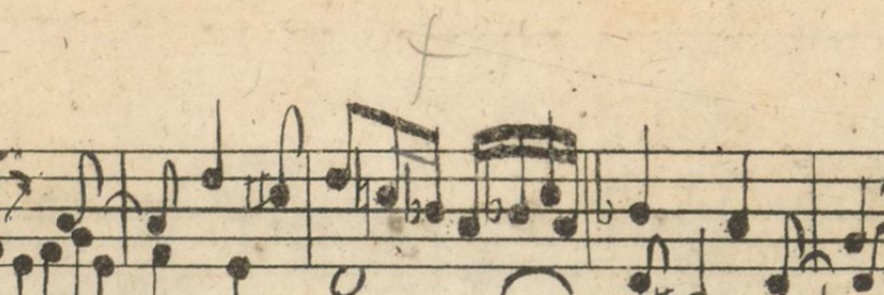
The fragment shows a cross in pencil, which indicates where the engraver made an omission: a sixteenth beam was missing. The ratio between gray value and hardness of the graphite points to a 19th century pencil. This would indicate that Bach did not make corrections in all engraved copies.
The use of pencil, the x-mark and the thin beam makes the correction stand out, if black ink had been used it could be made barely noticeable.
The engraved plate with the odd page number 37 is printed on the left - verso page.
When it comes to listening to Bach's music, we can experience perfection. The quality of the compositions and performers is flawless. So you can think that the copies made under his supervision and the music published by Bach are also flawless. That is not the case.
Carl Philipp Emanuel Bach tells that his father noticed the smallest mistakes during performances. But the picture that emerges from the parts of his cantatas, from engravings and handwritten copies, shows that playing the score faithfully leads to playing errors.
Bach was able to detect these errors. He could have agreed with the engraver to deliver a proof for each page, check it and then adjust it. Adjustments could be divided into two tasks, additions and corrections. A wrong burin line could be hammered out with special tools, a labour-intensive job that could lead to virtually invisible repairs in the hands of an experienced engraver.
The printed engravings were in stock in his library and at his points of sale. On the basis of a list of errors, additions could be made in each version with ink. The surviving engraved scores show that this was not done systematically.
Bach could rely on skilled copyists to create the individual parts of his cantatas. They are sometimes mistaken. You could expect a trail of corrections. After proofreading the copy, after an individual lesson with a singer, a rehearsal if there was time and then after performance and retakes in later years. There is no such clear trail.
Sometimes Anna Magdalena Bach made a copy on commission. Before handing over the copy to the client you would expect corrections in Bach's hand, here his music went on a journey into the world, to us, but it will also have returned to him now and then, a performance by a skilled musician who relied on the written copy.
We can mainly situate the corrections that we find in a teaching situation, then there was time and necessity to document calligraphically. Dealing with mistakes on the spot was business as usual, it wasn't about doing everything possible to arrive at perfect scores, it was about having the ability to correct mistakes immediately. This is a different mindset and attitude.
Checking is a tedious task, you have made something, it is finished, you want to continue with something else, not go through the same thing again, others are also experts, you must be able to trust them.
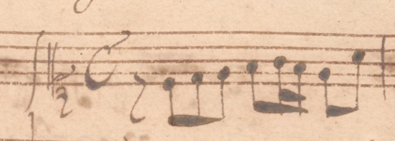


For at least fifteen years, Bach used the first version in his lessons.
Modern editions adhere to the latest version.
Harpsichordist Glen Wilson: "The general opinion is that the later version of the theme is more "mature". Is it, really? I personally find the dotted rhythm very distracting to the majestic surge of this wonderful fugue. ... But the dotting of the theme forced Bach in two places to abandon this important figure. ... to me it seems clear that the dissonances and theoretically questionable parallels that render the C major fugue in its original form so pungent, struck the aging Master as going too far. ... I see Bach's revisions of WTC I as a result of changed perception that led to distortion rather than improvement. I believe that almost all the revisions undertaken after Bach wrote out the 1722 copy were motivated by considerations of voice-leading and contrapuntal purity. Yet in my opinion, higher musical values, such as unity of motif, strength of line, and expressive power, were almost always sacrificed, in the post-1722 revisions,
Yet I would argue that, just as an etching can be prized in earlier states than the final one, the various stage in the revision of WTC 1 also have their value." - (article 4)
Kayser's score also sheds a special light on the order of the pieces: Bach initially kept the key order of his example Ariadne Musica by Johann Caspar Ferdinand Fischer, of which he will have obtained and could affort the reprint from 1715, with the minor scale before the major key in some cases.
In revising his music, Bach sometimes chose to lengthen a piece, as the comparison with the Kayser manuscript shows. The original set-up often shows his preference to highlight Renaissance proportionality: dichotomy, tripartite and quadruple divisions. Extension intervenes, Bach usually chooses to make the last movement longer, which means a proportional shift of the drama.
Making the transition from modern scores to historical sources, and looking at them one by one, can enrich your music experience enormously.
In the past century lute players have gained a lot of experience playing from facsimile editions in the absence of modernly designed scores. Lute literature is extensive because it was a prominent instrument for centuries, the quality of the compositions is surprisingly good but was largely forgotten. Recordings and discussions on forums show the difficulties musicians have to deal with when properly reading the sometimes enigmatic tablatures. Many a misinterpretation has been proudly shown, it is almost inevitable to make mistakes, history can only be partly unravelled, making good choices takes a lot of study, building on shared insight is crucial.
Recent recordings of the violin sonatas based on facsimile editions of Bach's autographs show that even famous violinists can miss the mark, avoidable mistakes that would benefit from knowledge of calligraphy.

For the re-enactment in 1723 a rhythmic change has been added in pencil, a change similar to the one that will be given to the first fugue subject of Das Wohltemperierte Klavier I.

As a musician, researcher and enthusiast, what do you need in a next version of an
historical critical edition of all Bach's works?
Improved accessibility to all digital scans, to be able to compare immediately on bar level with all previous critical editions without being an accountant, no definitive edition but complete in the sense of all existing versions of a score, the connections of which can be seen at a glance, a signpost to all errors, corrections and revisions. availability of all explanations, historical and real time, the possibility to overview all works dated on an annual basis chronologically. Uncertain dates or periods can be labeled on a tentative basis or starting year. A new layout is needed for digital modern printing, there is much to gain with corresponding layouts. A Urtext edition will have to serve the original and allow easy comparison, which means a lot for the requirements of the layout. Being able to deal with uncertainties, different conclusions and changes should be part of the architecture. No walls, all free.
Rapid accessibility and the possibility to compare chronologically will enrich knowledge. Gaining insight into who and why conclusions were drawn about dating, and immediately documenting progressive insight prevents working with outdated facts for a long time to come. The amount of relevant secondary Bach literature is too large to be humanly manageable, roads are necessary.
Building the infrastructure to provide eagle eyed overview as well as sharp view on microscopic details should be the primary goal. Incorporation of knowledge of calligraphy would be a matter of course. Precise description of all writing tools and materials used, including paper thickness and ink composition should be part of the standard description.


This folio is a terrarium for quite a few inksect species, besides that there are some adornations with splattering, wipping, strikethroughs and curlings.
The text of the choral is written after the notes on the following folio, not between them. There is a block of text in ink, and a barely visible version in pencil, which crosses the line of what can be deciphered from a digital scan.

The two naturals in the second bar show two forms. The first was added afterwards and is visually not immediately clearly connected to the raised note. The most striking feature of the second version is the open area on the right between the two short horizontal lines. The rastrum did not ink the second line of the staff at the bottom, which was set by hand afterwards.
When we make a faithful copy we can assume that it should be neat, but perfect neatness differs from what we find. The entire arsenal of correction methods is an integral part of the scores, to be applied when needed, they are not errors, they belong.
How to deal with that is personal and therefore characteristic of writing. Roughly speaking, you could say that Anna Magdalena makes more mistakes because overview and focus sometimes slacken, and she uses several techniques to finish it as neatly as possible. Johann Sebastian is always fully concentrated and in control, but with him writing is also composing, a brushing away gesture in between is his trademark, a revision on the spot.


In the three fragments of pieces above with a strong improvisational character, the harmony has been noted, but the elaboration of this has been left to the musician.
Prelude BWV 923 in b minor, which Kayser copied after the end of his copy of the Well-Tempered Clavier, is a preliminary study of Bach's Chromatic Fantasia BWV 903. The key could indicate that this was originally supposed to be the closing prelude. Beginning and ending would then be parts with an improvisational character, the first prelude moving pleasantly within its key, while the last breaks through on all sides.
The chromatic preludes have survived in many versions, the chronological sequence and dating being a complex puzzle, and because of that was to last piece to be published in the first edition of all Bach's works by the Bachgesellschaft.
My personal and speculative analysis of the coherence and sequence is the following:
Bach plays his collection of toccatas when visiting his uncle Nicolaus Bach in the mid-1710s. Nicolaus has built a lute-harpsichord which was tuned in equal temperament. Bach recently purchased Fischer's collection, a recent reprint of pieces that are a blueprint for a collection of preludes and fugues in all keys. Bach improvises a chromatic prelude and fugue incorporating all these elements. When Bach compiles his collection in all keys in the early 1920s, he ultimately rejects the piece in which the very first spark of inspiration was worked out and documented. The improvisational character of his compositions has given way to a more structured way of composing and the frantic, delirious chromatic drama has become to unbalanced for his taste to satisfactically finish the whole sequence.
The chromatic fantasy with its constant mood swings fitted seamlessly into the world experience of succeeding generations. It was adored and cherished, never out of sight, standing on its visionary own.

Bach composed his great mass from his most successful compositions and managed to forge them into a completely new unity. He replaced the original, more time-bound texts with the most universal language besides music he knew well, Latin, in order to preserve his legacy.

The transition period from using church modes to major and minor scales shows intermediate forms. To err is human, we all do it, and Bach was human too. With a church tone notation we should be extra alert to characteristic intervals.
In some places in this sonata where he composes a major sixth, he adds an explicit natural sign. Strictly speaking, this is superfluous given the single accidental behind the clef, but it is helpful for sight reading because of the explicit clarity.
The e-note in the bass on the second beat of this bar lacks an accidental. Harmonically, however, it is clear that it must be a lowered note, an e-flat, sounding in unison with the e-flat of the alto. Prima vista this bar is riscy.
The same occurs in the following fugue in the second bar. Identifying and correcting such omissions requires good preparation when copying a score. Comparing in advance a handwritten score with a modern edition of the Bach Society is essential.
The first half beat of this measure makes polyphony explicit, we see a quarter note and two quarter rests. Rest marks on the second, third and fourth beats of silent voices are lacking, without causing any problems for readability.


The legibility of the bister ink shows that the continuous extra common staff line was preceded by individual short ones. The extra horizontal stave lines through the note heads are not optimally placed, with a slightly disorienting effect.
Each note, if applicable, gets its individual accidental with Bach, which deviates from current notation rules. The g sharp at the top is restored to a g in the same measure by a natural sign, the second g needs no explicit natural sign.
Accidents are aligned horizontally in front of the notehead, but can later be aligned vertically without causing readabilty problems.
The vertical barlines have been filled in by hand in the upper fragment, left with short arcs, the quill turned 180 degrees and the ink smeared accidentally, the following is drawn like the stems, with the quill returned to its usual position.

To complicate matters, the raised note of f sharp in this new key can function as a leading note to the new temporary tonic, but a symbol for a double sharp did not exist.
The f sharps in this fragment should be read a fis double sharps.
The discrepancy between our modern staff notation and the way Back notated this, underlines the importance of knowledge of calligraphy.

A pattern that you may encounter regularly is that title, clef, accidentals and time signature on the first staff are done in raven, and the rest in goose. With small accindentals it is important not to exert too much pressure, or rather only to touch the paper with the nib. Ten-year-old Friedemann has made sure of this in this passage, and he has been able to apply an improvement. But then again, handling the pressure cost so much focus that precise placement on staves lines was no longer achieved.

We can take some time to be temporarily in love for a moment with his clef.
Johann Sebastian's older brother (like the composer of this piece also named Johann Christoph) also uses this technique of rotating the quill for tin horizontals. It is time consuming and interruptive, Johann Sebastian usually does not take much of a trouble, his extra horizontal stafflines are thicker as his verticals.
Positioning the extra horizontal line at an equal distance to the stave lines is difficult, we see a great variety. Perpendicular rectilinearity is also a challenge, but readability generally benefits from a slight difference in formatting. The connections are sometimes drawn as a whole, but compound lines can also be seen, which make a more uncertain impression.
When Johann Sebastian Bach's brother died in 1721, he came into possession of a collection of scores from the family archive: the Altbachisches Archiv.

Fis and gis switched positions on the second clef.

The elaboration of the goal to calligraphy like Bach has many possibilities. You can content yourself with the same materials and tools and leave it at that.You can strive for the perfect copy, indistinguishable from the real thing. You can master his handwriting and writing well so that you can apply it satisfactorily yourself. You can break new ground artistically. Friedemann really does his best here to emulate the characteristics of his father's writing as closely as possible, you can see the feather tilting and conforming to the dynamics of the example, this is hard working.

It is instructive to leaf through this booklet and determine for yourself what belongs to whose hand, the father or the son, and to see the trials and progress, it is a fairly complete manual.
The booklet has a nice cute clear format: 17 by 20 centimetres, three double staves on a folio, pieces of music spread over two pages. Visually manageable, with music that is also interesting for an advanced musician.

1725 - BWV 1003 Sonate 2 Grave copy Anna Magdalena Bach
"Old concept: Love is blind. Marriage is an eye opener. New concept: Love is not blind - it simply enables one to see things others fail to see." Johann Sebastian Bach
Biographers find it difficult that we know so little personally about Bach. Anna Magdalena Bach's copies are a great declaration and demonstration of love. Personally, attentively, with all her heart. We know a lot about the love affair between the two of them, and you can experience it for yourself just by reading the scores.
This is lost in modern print, don't sell yourself short and go back to the source.

The state of the motor skills that we can deduce here might also say something about his ability to play music at that period in time. They are the same muscles used in controlling an instrument for phrasing and dynamics. Composing is a conceptual skill, playing music is art and athletics, just like calligraphy.
Over the lyrics: "as if fleas, lice and wasps are all fighting together".


Another approach is to complete note head and stem in one movement. The stem is then usually positioned to the left or right, depending on what is happening around it.
Round lollipops or drops; the shape of the noteheads differs quite a bit depending on the sequentiality of the writing method. The continuous movement is clearly visible on the drop-shaped notes, the beauty of these notes contrasts with the somewhat more blunt appearance of the impaled rounds.


1715 - BWV 974 Adagio copy by Johann Berhard Bach

We have a fingerprint from the anonymous copyists left index finger above the last faded thirty-second note to be. Nice calligraphy by the way, and fresh appearance of materials.

Line thickness depends on vertical direction. With the straight slanted line, start, progress, and end are of equal thickness. In the arc-shaped beams, which are a result of a different motif in the noteheads, beginning and end are narrow. In the lower bars we see combinations of both movements, the arc sometimes becoming the more complex wave. Several beams joint in one group usually follow the same movement, but sometimes they acquire individuality.
Spacing in the upper double bar is irregular, so that the final chord has ended up in the lower margin in organ tablature. Friedemann must have been amazed at this lesson when his father wrote down this prelude, there is so much to see. The lower right corners of this booklet have become dirty from much leafing.

The bottom manual staff line is drawn as a straight line per quarter beat. Above that a manual staff line composed of many short waves. The bars of the thirty-second show the same kind of variety, now at a slight slant: straight line, short waves, and now also waves per unit eight.
A complex whole that can nevertheless be overseen at a glance.

They make a dominant contribution to the gray value on the page layout, the appearance of the whole.

The horizontal line that rhetorically connects notes in the above fragment consists of two connected waves, each of which is subdivided per note into smaller arcs. Compared to the two trills on the right, the line is very delicately drawn, lightly and similar in apperance to the ascending thrill, with which the phrase is melodically related.
The motor skills of singing differ from the motor skills of playing an instrument. Bach's vocal lines can be difficult to sing due to instrumental features in the motifs, and conversely, the natural rhetorical expression inherent in the human voice can require extreme concentration to make it sound on an instrument.

Bach sometimes makes deliberate use of the difficulties that performers have, composing vocal parts that are beyond the reach of young sopranos, such as in BWV 179 Aria 5. Or the oboe parts in BWV 150, which were impossible for Johann Heinrich Geyersbach ("Sie sind ein Zipfel Fagottist").
Perfect performances do not do justice to the meanings or chosen expressiveness of the music in such cases, good enough is better here too, because they make struggle audible.

He remarks on this passage: "Sometimes, slurs do not feel quite right, although they are complicated enough...Trying these slurs (and all of the other ones), I can only come to the conclusion that Bach must have used these suites - with relatively light work for the left hand - to exercise his bow hand and to invent new beauties for it".
A brief summary of his findings on slurs: "Some slurs are made twice on the same spot with the pen. What happens more often is a "hooked' slur, is this slur trying to tell us something? Oh! Mrs. Bach! Why are your slurs so high over the notes? One note more under the slur, or less, already turns my whole bow-arm machinery around! My extra interest in the often quite hard to interpret markings made me do away with a great number of preconceived ideas and credulously observed conventions. Slurs often start or end on sharps and flats. There seems to be little preference for up-bow or down-bow, metrically speaking. Expression and variety are more important. The slurs are the fruit of earnest study and practice by Bach. Two slurs rarely meet. Slurs crossing over important parts of the bar are rare. In small transitions there is often a little jerk with the bow. Slurs are short. Long slurs are rare, almost exotic."
Many worthwhile observations about slurs, and other articulation marks can be found in John Butt's book Bach Interpretation.
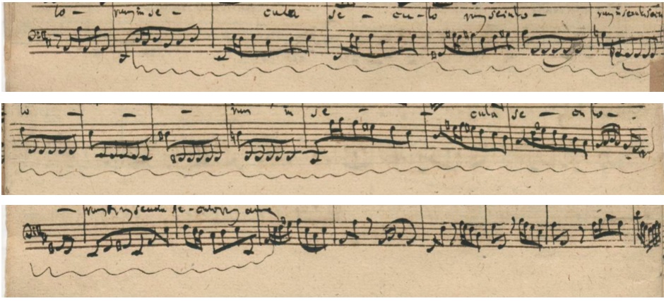
"In eternity."


It didn't work and I didn't understand why. I immersed myself in old drawings and the Gothic architectural style. Then I experienced something remarkable: I could perfectly copy neo-Gothic windows, but I got stuck with authentic medieval windows. My brother was working on the same project and showed me his drawings, I was stunned by his perfect drawings of the old windows. The crux was that he drew what he saw and I drew from assumptions of perfect arcs and proportions.
After the Second World War, cities that had been bombed were resurrected, authentic Gothic was replaced by neo-Gothic. The differences in style can take some practice to see. We tend to be charmed by tight rankings, order must be, it takes effort to be critical of that.
The ancient Greeks already knew when designing their temples that deviations from perfect provide much-needed liveliness in the final realization. They embraced it. The Vitruvian man is framed in perfect proportions, but he himself is an individual human being.
This learning process can also be observed in the transition from hand-engraved scores to digital ones. With his experience, a master engraver ensures the much-needed small deviations from perfectly mathematical spatial divisions. That comes naturally, sailing on intuition and feeling is enough, relying on a perfect grid is fatal.
Work like the medieval stonemason chopping his blocks. A solution is not deliberately designing deviations. You have to look for it in the same design and construction methods. Then they are a result of your way of working. Keep it simple, do your uttermost best and strive for clarity. Your bonus will be attractive liveliness.
Incorporating intuitive decisions into a digital design is a monster assignment. The style manuals of successful digital notation programs speak with great respect of the old manuals of master engravers. Yet they will never succeed in what you can do with your hands. The level of detail and individuality you can add to each bar by hand is unique.
There is much authentic Gothic in Bach's art, in his music and in his calligraphy and there is a lot of neo-gothic in digital note programs. No matter how much code is written, a digital representation will fall down the rabbit hole to a world of strict regularity. The programming of irrugularity is at odds with the core of its being. In addition, each score is unique, which requires creativity from the calligrapher, how to deal with something that has never happened before.
Good artists copy, great artists steal - goes the saying. That statement sounds more like a moral judgment than insight into the way in which an artist internalizes a good idea. Making a copy is part of the first phase of the imitatio: researching, developing and mastering a style and form of expression. To call this stealing is misplaced. We must respect and admire the learning phase and recognize that creativity is irrevocably linked to making from the start to the end, from imitatio to emulatio.
Strict conductor Gardiner wrote a biography of Bach and portrays him as a strict conductor. Learned professor Wolf wrote a biography of Bach and portrays him as a learned professor. Keyboardist Williams wrote a biography of Bach and portrays him as a keyboardist.
These men are excellent scientists, their valuable biographies stand out in Bach literature, they carefully base themselves on the facts. The moment imagination kicks in, there is personal projection. It has a funny element, they probably didn't realize it while writing. As a reader you should be careful.
What helps is to read them all - step by step you learn about the facts and what can be supposed by imagination. Then you can judge for yourself, weigh the flaws and the great insights. What is very difficult: discerning what you project yourself.
It is actually impossible to escape from How Can I Make This About Me? - and the question is whether you should want to. You can laugh about it when it comes out clearly (when it is you), or cancel because it is vanity (when it is someone else), but actually you should foremost appreciate it. Be mild, your imagination is a great gift - without it there is only loose sand.
If you are making a copy of a Bach chorale, you should ask yourself if you are busy building a neo-Gothic cathedral. You fall down a rabbit hole easily. Understanding a style and knowing it can save you from this.
We can dissect Bach's calligraphy style into many small parts and then set to work to raise a new building. If you work hard you will succeed in convincing untrained and trained eyes. If you try really hard, you will inevitably fall down another rabbit hole, that of your own world, it's natural and this time it is a very good thing. As calligrapher embrace the space like a Vitruvian man. As typographer reconcile yourself with being the regular girl or guy.


In the second measure, a sixteenth note has been scraped away and moved.
The staff line at the top of this fragment captured a hair (nose?, eyelash?, maybe she just had her hair cut?).


The piece did not end here, but it was a good place to allow the right hand to turn the page. Except then for one miscalcutalion: it became a verso plate, a page on the left and the continued music was already visible for the owner of the book.
Folio 1 has four page different numbers, in three corners and under margin. The engraver and Bach eventually gave it page number 48 - an even number for a right-hand page, which is exceptional.
The engraver for who this was designed skipped the floral embellishments of folio 2, but compensated for that on the last plate to show what he was capable of, which frankly was rather bad, honest and clear.
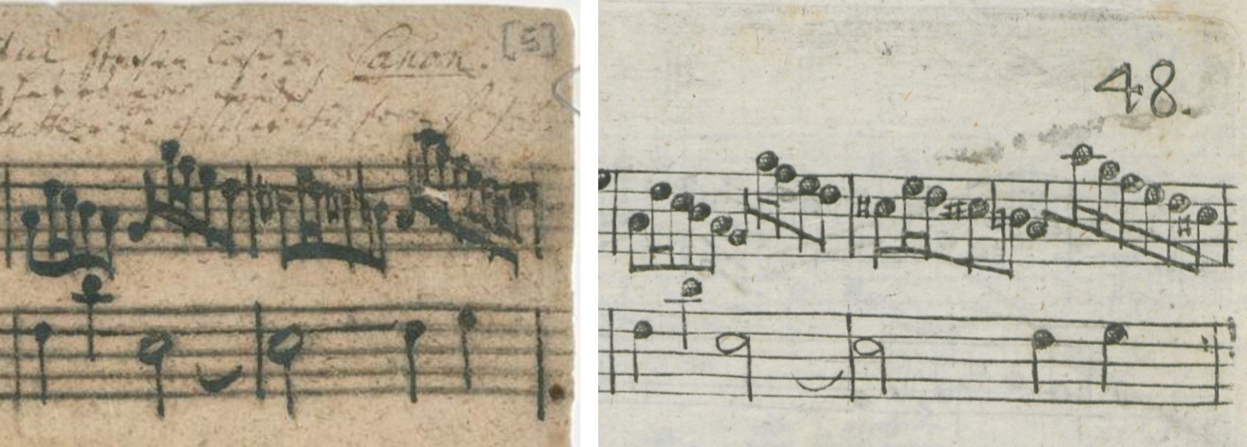
1751 - BWV 1080 Canon by Augmentation in Opposite Motion engraving
The left folio is part of three sample sheets for an engraver. Staves and music were also first drawn up in pencil and then traced with ink. The music notation anticipates the stylistic features of the round tip of the engraving needle.
The opposite movement was not only a subject in the music but also a given on the mirror-image copper plate. There are several ways to work in mirror image.
The preliminary drawing could be soaked in oil so that the paper became translucent. The turned sheet could then serve as an example. Another way was to hold the paper on the window and trace the mirrored version on the back. The example can also be placed diagonally in front of a mirror, so that the engraver could copy the mirrored image.
Children who learn to write do so regularly in a mirror image, and some can write in a mirror image for a lifetime without any problems. For an engraver, that is of course a handy feature, something that can also be learned.
Little was known about the art of accurately conveying writing examples. Some master engravers succeeded using the following technique as described in 1696 by the Lübeck writing master Peter Tidemann: the script is written with a efflorescent ink prepared from water and charcoal, then placed on a polished plate lightly rubbed with white wax, and printed. The script image then appeared accurately on the plate and can be carved by an engraver with a burin. Wax and charcoal are very attracted to each other, they are a happy couple and work together to achieve beautiful results. The transfer was simple, but skillful handling of the burin still requires a trained hand and a sharp eye.
The example where the music has been put in ink over pencil seems to indicate the transfer method to a layer of wax on a copper plate.For that to work, there must not be a strong connection between the gum arabic and the pigment particles. You must have access to ink powder that you dissolve yourself in water with a very small amount of gum. That doesn't seem to work here, the usual ink composition has been used. Possibly the technique was not fully understood and the right raw materials were not available.
Giving an engraver a large order is a financial risk. You want to know in advance how he will do. In such a case you can agree to have a few plates made first. Then you don't choose the first pages, you want the likely first impression to be perfect. The test plates may show that you want to make more precise agreements about the execution. If they are good enough, they do not need to be stung again. The engraver did his work conscientiously and delivered the proof along with the provided examples, so that they could be disussed and agreed upon.
To make comparison possible, the engraver made sure that the examples were not lost or damaged. He opted for a mirror setup, physical or mental.
The engraving is slightly larger than the example, no tracing technique has been applied. The engraver copied what he saw. Example and copy both have a certain stiffness, and the placement of the writing in the limited space is not confident. The spacing of the writing is lagging behind the facts. Bach got into trouble with the sixteenth passage at the top right and one cis even lost its head. He adjusted the distance between the note heads, the engraver took a wider bar, opting for regularity in spacing.
The crosshatching on the relatively large and very round note heads of the engraving gives them a highlighted 3D illusion. The engraver let some notesheads collide, with each other and narrowly with the barline. He put more pressure on the beams making them thicker, the shot-out line on the sixteenth melody shows that he pulled the beam several times.
Bach opted for two wave beams and two straight ones, the engraver follows only one wave. In some places, two sixteenths are connected to a beam that rests against the staff line. If there were space between these beams and staff line, it would be visually unsettling. In both cases, the last accidental does not coincide with the position of the notehead, but this does not cause reading problems. The natural sign lends itself perfectly to being expressed with the engraver's needle, there is balance, clarity and strength.
In Bach, the stems are connected to the middle of the note heads. With the engraver, the note heads are attached to the left of the stems, with exception of the semitones, which he notes as Bach initially does.
The engraving shows ink stains that have not been rubbed off, this plate tone has its own charm and visual vocabulary, a different world to the grease stains and who knows what on Bach's scores. The ink was oil based, which took about a week to dry, after which the paper was soaked for the second time and the other side could be printed. The black color was soot and with the plate tone left a gray cast on the bleached paper.
There is a brown ink dot on Bach's fragment, different in color from that of the notes. It marks the position of the second staff line. At the bottom left of the page, a similar dot can be distinguished in the G clef. Bach and engraver choose to keep register at eye sight in stead of measurement, with no side margins, and more spacing beside double staves.
The appearance of the printed engraving is determined by its method: the plate pressed the paper smooth and left an indentation, which was partially reversed by the second print on the other side. .
The triangular relationship between bistre, graphite and soot has a colorful gray matt appearance on the example, the oil ink of the engraved plate is simple black, but looks greyish due to the firm patting.
All in all, there are some differences between the two scores, and it depends on your observations to what extent you call this almost completely the same, not only in content but also in appearance.
Johann Christoph Friedrich Bach (1732 - 1795) wrote in the upper margin: "Papa had this title engraved on the plate Canon per augment: in Contrapuncto all octava, but he has it again crossed out on the sample plate and set as written."
Papa.
That is sweet.


Bach adapted his writing style in pencil to that of the engraver. After the pencil sketch he had the opportunity to make improvements in ink, as is obvious to aply for example in the top line of folio 2: a margin on the left and a stressfull contraction on the right.
Bach did not exploit this possibility offered by the pencil sketch. He adhered to the engraver's instruction: "and then you overwrite the pencil lines with ink".


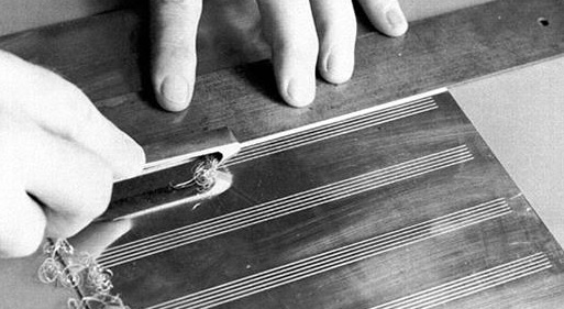


Pythagoras gave his students quotes, so-called akoesmata (that which must be heard), such as: "Everything looks like a number".
Bach's Welltempered Clavier deals with fixing the Phytagorean comma, making the best out of a messy world.
Bach's music is made up of simple yet expressive subjects creating a complex whole. They have abstract characteristics, leaving the symbolic range of meanings undefined.
Words can evoke the appearance of precision, but each word is a world in itself. Numbers and geometric figures also have that property.
Bach's expressive art evokes a lot of synchronicity, meanings that seems not to exist by coincidence but by deliberate design.
Does it matter whether the basis is conscious and intended or not? The complex design that originated from simple building blocks was partly inspired by a specific world view. But the ultimate range of meanings extends far beyond that, an incalculable network of connections. That range can be divided into related and separate collections: cultural collective consciousness, now and then, and personal beliefs, of Bach, and you. Calligraphy is an entrance to this realms.
Bach was surrounded by well educated, clever and talented students, man trained in the art of writing, they knew how to draw a curl or two.
The elaborate title states, among other things, that it was written "for the pastime of those already skilled in this study". The word Studio is spread over two lines, it collided with the right side of the page, indicating a certain awkwardness with calligraphy.
Modern Bach students have found ingenious meanings in the sequence of curls at the top of Bach's titlepage, presuming utterly control and precise visual clarity of how to divide the Pythagorean comma. Their explanations shows above all that each number can mean everything.
An enigmatic encryption doesn't seem quite in line with his usual coy curling. If it had been his goal, it would likely also have been given a place in Wilhelm Friedemann's notebook, who's education might have been the main trigger for composing this collection and how to tune was for sure a part of that.
Bach will have been particularly pleased with the well-executed ornamentation at the bottom of the page, beautifully positioned with flowing lines. He could make a good impression on his students with that. Nice.


The two sums notes above have some numbers in common, although the works are unrelated. They give a vague idea of the numbers that must have been running through his head.
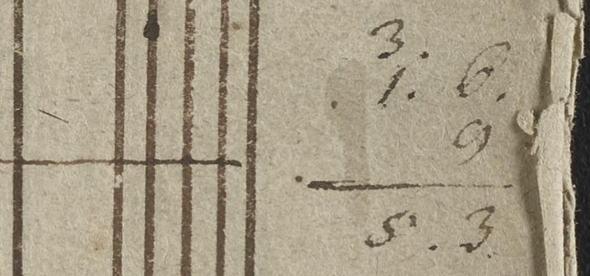
{3 Gr.} + {1 Gr. 6 Pf.} + {9 Pf.} = 4 Gr. + 15 Pf. = 5 Gr. + 3 Pf.
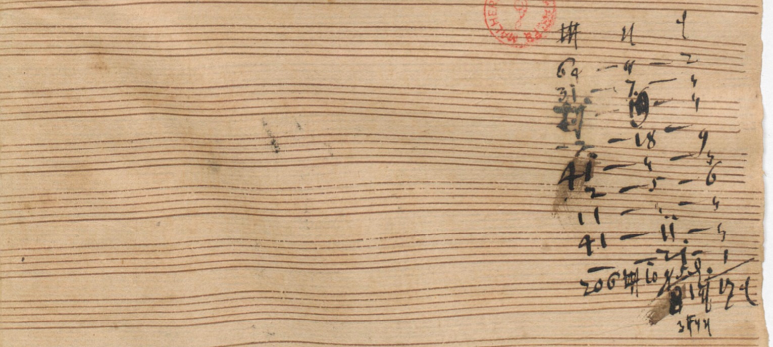


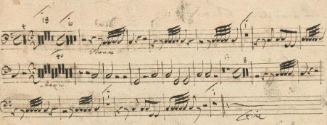


A copy of this Klavierbüchlein was made around 1770, half a century later, by a student of Friedemann under his direction, with emotional impact, omitting Bach's fingerings for the BWV 926 prelude. A pencil line is marked in that copy for the alignment of the margins with respect to the staves, the rubber eraser from England has not reached the German market yet. The paper was bleached.


Unexpected signs of wear and tear, such as an unpredictable wide split in the bow here, can be ignored for a while. Four folios later does Bach decide to give up his fine writing nib and re-trim.


In the right margin you can see that the splitting of the paper was not perfect either, some musical notes shine through the inserted page.


The criterion: from easy to difficult is easy to follow for composition, but for learning how to play that constructive line is missing. Occasionally we can also get a special glimpse behind the scenes of the composition process because Bach in severall cases wrote early versions. From a calligraphy point of view, the notebook is a goldmine: we see Friedemann learning how to write. On this folio we see him writing down the names of the notes for the tenor, and doing his utmost to position them well, which is difficult to keep up to the end. In the elaboration of this assignment, the quill was first physically placed on or against the note heads, leaving short dashes behind.
The words in the fragment above are written between the lines of the staff, unhindered by the very small size, we see that Bach succeeds in shaping all the letters, with thin and thick lines where they belong.
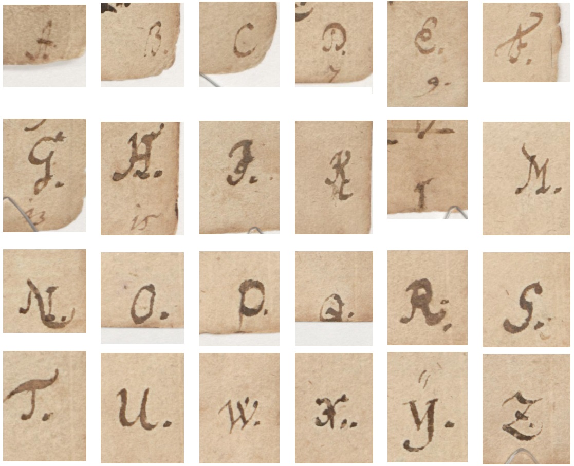

This collection was written up in a short time, maybe about a month. Each letter marks 4 pages, it starts with capitals and continues with minuscule letters, there is dynamism and a certain regularity in sharpening of the nib. You can read periodicity from it, an estimate of how long a nib lasted.
The position of the feather is different for notes than for letters. Bach mainly wrote notes, when switching from note to letter, he did not always adjust the position of the quill: the horizontals are then thick, the verticals thin. Letters and words notated in a musical pen position.


Van den Velde and Frisius seem far removed from Bach in time and place, but that is only apparent. Van den Velde's book was published in many languages and had reach throughout Europe. Frisius lived in several countries and was, among other things, a commercial agent in luxury goods on behalf of Duke Johann Ernst von Sachsen-Weimar, under whose descendants Bach served and did jail time.
There were other excellent famous calligraphy example books, one more beautiful than the other, but what makes The Mirror extraordinary is chapter 3: The Foundation Book - a splendid clear manual about correct writing posture, cutting of the pen and types of writing used in europe. The intended audience of the Mirror was writing masters, to teach them how to teach. But the third chapter was set up directly for students. It made great impact and was quoted many times with high esteem deep into the 18th century. For 17th and 18th century Germany we can mention calligraphy masters Arnold Möller (1644), Gebhard Overheide (1665), Peter Tidemann (1696) and G.H. Parintius (1703).
I have prepared a partially English translation of his teachings, selecting what is relevant to Bach's calligraphy, which is available here.

Calligraphy allowed you to distinguish yourself, it belonged to noble and learned people. Writing is connected to how you appriatie yourself, your self esteem and social status, you belong or you are excluded. It matters in society for getting jobs and respect. These were crucial skills.
Bach prided himself on having acquired his musical knowledge and skills through self-study, copying scores was his education. He had to rely on the quality of his art to get ahead in society, and did it all by himself.
There was no funding for a university, so he was on his own when he completed his grammar school education in 1702. Coping with the lack of an university title was a hindrance. Dealing with not having a title was a barrier to gaining respect, appreciation for his skills, and getting a job. Bach succeeded very well in obtaining recognition as a composer and he proudly calligraphed his amassed titles on covers.
Bach's refined masterful rhetoric musical skills did not easy found their way to words.
He was reluctant to write letters. This may possibly be related to the lack of a university education, a letter could make it immediately visible. A backlog in writing instruction, acquired vocabulary, the weapon of coming up with catchy bonding and confirming phrases that show you belong to a group you identify with, and a corrective and instructive network. This was risky and beyond his ability and his interest to perfect through socialising and self-study. What applies to the content applies to the form.
"We will have to make do with the lesser, mediocre candidate", sighed a disappointed member of the selection committee at Bach's appointment in 1723 in Leipzich. That may partly explain Bach's fire with which he produced an enormous amount of superior music in the coming years. Quality was his retort, but quality can fall on deaf ears, it is not self evident, one has to be receptive, everything of value is vulnerable but also resilient. It made sense to be vigilant. Staying verbally silent saved time, could be wise, but can frustate.
Johann Sebastian Bach: "My masters are strange folk with very little care for music in them".
The quality of the lyrics that were set to music varied enormously, depending on origin. Chorale texts had been put through a sieve through history, filtered for eloquence, comfort and meaning. Contemporary poetry reflected the perceptions of the common man, the constant need for confirmations of certainties in his the inner world, clumsy and constantly missing the mark, reigned by drifts, fearful, unartistic, aggressive and weird, and especially typified itself by the metaphor of yellow mud that it sought to condemn.
Cantata BWV 94 is a moral condemnation of pleasure and magnificence. Stylish vital elegance is brought to life by beautiful flute harmonies. The delusion of base emptines has no expressive part in the music, except for the words being there. As such it is a hymn to the full world around us, heaven on earth, to admire and to love, and befooling the lyrics, letting it fall on visually impared deaf mudmoles without ears.
Leading transcriber Eugen d’Albert, wrote in the preface of his 1906 faithful to the original edition of Das Wohltemperierte Klavier: “Bach did not know the innumerable stages of passion, pain, love, nor did he suspect the possibility of expressing them in music.” Moles that burrow underground spend most of their lives in a tunnel system they dug themselves. The excavated material is usually brought to the surface in the form of molehills.


Lyricist, philosopher and poet Johann Christoph Gotchd wrote for Funeral Ode BWV 198 the line: "und tilgt der Erden Denkbild aus" (and blots out ideas of the earth).
The score is written in hasty script, the text is barely legible. The shapes of letters are less well expressed, sometimes no more than a vague indication of the direction of the line of a letter, and immediately taking an advance on the connecting lines with the next letter.
Bach usually sticks to the words of his lyricists, if he does not, then his motivation lies in musical reasons, the fitting of words to musical structures. Nevertheless, the compilers of the Neue Bach Ausgabe have seen reason in this case to deduce a special intervention from the script: Denkbild has become Dreckbild. From mindset to sticky shit. With such a striking change you could expect a temporary extra focus on the writing style, a short trip to neater writing.
The replacement of the world of ideas with a shitty image raises many questions. Is there sufficient evidence to assume this, on what grounds? Is it appropriate, how do earth and shit differ or resemble in their presumably shared Kurrent r? Should we question expert ideas or can we blindly (like a mole) trust them?


The instruction books describe many types of writing. In Bach's case, two are especially relevant: one that we can read easily and one that we cannot or hardly read.
Italian is easy, also called Humanistic Italic, Humanist minuscule, Roman type or Latin. The letters are large, the height is made up of about five times the width of the nib. This is familiar to us, the foundation of how we write.
The Italian script was appreciated for its elegance, clarity and speed. Jan van den Velde explains that the shape of these letters are all based on the o, i and f. (It almost mirrors the three basic forms of the Paleolithic proto-writing system, with its weightings easy for our motor skills and for our eyes to decode quickly.)
Puzzling to us, but easy as Italic to Bach and his contemporaries, was the German script, the Kurrent. Small, as high as about two and a half or three times the width of the nib, excellent for fitting between two staves.
The application depended on the type of word, foreign words were written in Italic.
Here and there, ornamentation has occasionally been adopted from the Gothic script, hybrid forms, in enormous variety, variations upon variations arising from spontaneous imitations of remembered examples.
There was not one prototype, these are collections that share stylistic features. Every design is unique, and so is every user, handwriting is personal and develops over time. Seeing what is similar and what is characteristic of a person, the deviations and small variations, can be a quite a task, but our brains are made for it.
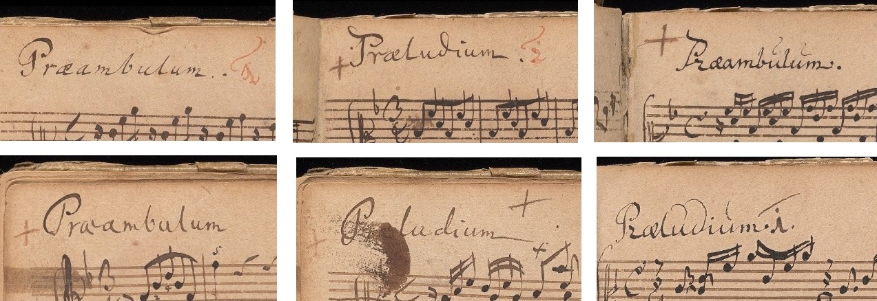
Folio 4 recto - Folio 6 recto - Folio 9 recto
Folio 9 verso - Folio 10 verso - Folio 14 recto
The capital P is written upright several times, as is also done on the title page of Das Wohltemperierte Klavier I, but he also started sometimes with a cursive capital. Starting point of the circular shape of the letter p is from the center, above and below.
Cursive and standing is likewise alternated more or less randomly within the minuscule letters. There is great variation in spelling.
The elegant Italian script predominates, as was common for titlewords, but we also see other style features. The combination of the letter a and e, the ligature, comes from the English, Latin and French script. We see a wide variety of graphic solutions in Bach for this special letter combination. Three times the letter a has been added, once only the letter e is left.
One instance of the letter e is heavily decorated with thumbprints, first a curved sweep downwards, then additional layers of obscuring ink to the upper left, a rather messy ornamentation.
The letter u is Italian but has been given a distinguishing mark from the Kurrent several times on top, which exists there to distinguish the letter from similar looking letters, but here it is not functional but purely decorative. In the last example, it is a backward repetition of the swipe of the letter d.
The letters b and d are both used three times and the way they are connected to preceding and following letters has differences based in part on the different appearances of the letter itself.
The sound group is in 4/4, the letter l is in half of the cases in 2/4 and for the other half in 4/4.
The final sweep of the letter m is embellished, elongated, curved, or dotted before the dot a few times.
Number 1 in red ink, in its basic form the simplest of all numbers, a vertical line, has a large collection of strokes around it, and transforms into the deepbrown letter i.
Adding and placing a dot after the title violates modern formatting rules, but was very common. There was no accompanying line to align the letters horizontally, which is why we sometimes see arc constructions or oblique positionings.
A cross sign is sometimes placed before or after the word, sometimes slightly inclined, tending to an x, and can be distinguished from the trill sign by its large layout. Different ink color is an indication of a later addition.
In this notebook, Bach used to write titles, clefs and accidentals on both quarter folios in raven and then switch to goose for notes. This working ahead was different from his normal working method for clefs and accidentals.
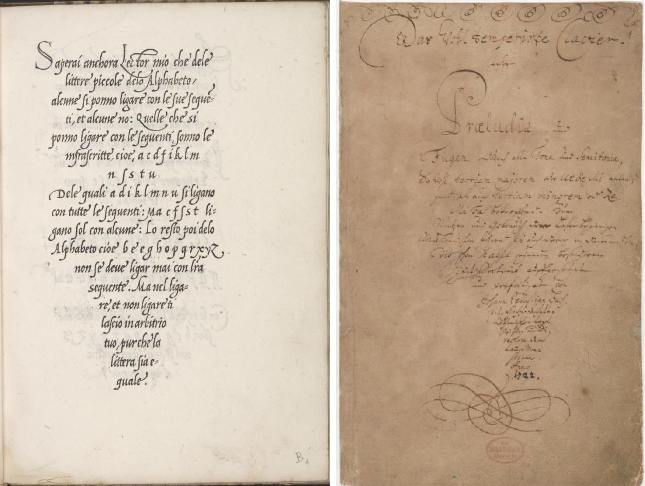
1523 - Il modo de temperare le penne con le uarie sorti de littere ordinato by Ludovico Vicentino degli Arrighi
If you leaf through the sample books of Ludovico Vicentino degli Arrighi, it is striking to see that the writer was partly left to the hands of the printer for the positioning of the text block. The printing technique used is that of the woodcut. Music engravings only came after 1600. The woodcut is to the engraving as the organ is to the harpsichord, coarser and less refined.
The funnel shape of the text block was a playful and shape-conscious presentation. Bach presents his title text in this model aligned to the right, but aligns ornaments above and below on the center line, a twofold idea. Ornamentation was applied after text formatting, and requires visual overview for the composition.
The top of the page is partially cut off, as a result of which the lines at the top are partially missing.

A similar motivation may have led Bach to decorate his title page for Das Wohltemperierte Klavier 1 with scroll ornaments.
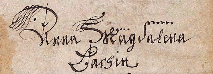


1744 - BWV 870 Cover copy by Johann Cristoph Altnickol
1715 - BWV Anhang 200 autograph
The letter c looks like a circle. The incomplete circle was not drawn in 1 movement, several lines were connected to the thinnest part, because this suggests a smooth invisible transition.
The symbol also appears with the time signature common time. Time signature capital C was historically developped from a semi-circle, representing imperfect numbers 2 and 4, opposed to symbolically perfect 3. There were two shapes, continuous and one with an angle in the top line. In the example of BWV Anhang 200 we see a hybrid between the two ways of writing, where muscle memory comes naturally to the general customary ornamentation of the capital letter.


Sei Solo: to be alone.


Bach used the music of this cantata again for his Christmas Oratorio. The connection between music and words is much closer in this original, and more understandable at the level of detail. Motifs are directly inspired by words.


Seven years later, Bach used the music again, but with a different text: BWV 207a "Price, later generations, the favorable fate".
The original form was inspired by an imagined metaphor and auditive translated into a motive, which connection was broken in the parody. This was no problem for Bach, in fact, this is one of its strongest sides, creating depth and a range of associative meanings. The one-to-one illustration appears to be usable everywhere, Bach had trust in the fate of his motives.
The multi-applicability of a specific auditory metaphor is an essential characteristic of his art.

It ends crowded around a manger, musically depicted in a short ritornel with syncopated figures. Bach has turned his sheets with staff lines upside down, which now have a downward curvature, so that the aria is embedded in a manger.
That was not intentional, that arose by chance, good art is rich and succesful in generating this kind of happy coincidence. Bach's art is extraordinarily rich with this kind of poetry, and it arises naturally from our predilection for patterns and repetitions, making sense out of it, and the effective simpleness, liveliness and applience of his motives.
This phenomenon is an intrinsic quality of art, and also defines the valuable role you have as a spectator. Observing, noticing and seeing meaning are active individual acts, you are not a passive participant merely experiencing what has been put into it to create it. Observing is also a creative process.
A creating artist is not just working out an idea in his head, the process of creating is as much typified by just doing, which has implications for the valuation of its meanings.
Not everything is intended, it can also have arisen, jumping in. That is not weakness but strength.
Doing is not a monologue for the artist in his solitude. Tools, materials and ideas talk back, it is a dialogue. A good artist is a good listener and observer. Culture has its say, just as chance will have it. There is artificial intelligence incorporated in dead things, which we experience as coming to life. An inspired artwork gives gifts and wisdom that can surprise the maker just as much as the spectator.
Bach's autographs also offer a dialogue, he is talking to you, studying his scores is a conversation, you have to listen and observe, it will give you unexpected insights and perceptions, understanding and presents, knowledge and joy.

In the original part of the above fragment the word “wounds” (in the Latin of Pergolesi's text: plagas) is the focuspoint. With Bach that has become “fame” (German: Ruhm). No words that at first glance seem logically and affectively interchangeable.
Both words “Wunden” and “Rhum” have been set to music by Bach more than thirty times, sometimes with great emphasis.
Here is a brief inventory of affective qualifications that can be given to cantata pieces in which these words occur. (The music also sometimes involves new text on existing music.)
Wounds:
BWV 5 - 2 Intimate, tormented
BWV 7 - 1 Solemn, rippling
BWV 12 - 4 Serious, laborious
BWV 31 - 4 Solemn, with dignity
BWV 46 - 6 Lamentable
BWV 78 - 5 Difficult harmonies, with passion, trembling motives.
BWV 101 - 6 Sweet and plaintive
BWV 103 - 3 Desperate, ambivalent
BWV 113 - 8 Gloomy
BWV 136 - 5 Music dances with cheerful tone, text serious.
BWV 145 - 2 Passionate Liberation
BWV 159 - 5 Calmness, balance, solitude, absence of any tension.
BWV 164 - 2 Disturbing
BWV 168 - 6 Serious
BWV 182 - 7 Includes the paradox that suffering is a joy.
BWV 199 - 6 Consolation song, sorrowful heart.
BWV 199 - 7 Mystical discourse - merry song
BWV 244 - 51 Bewilderment, powerlessness
BWV 244 - 52 Aggressive
BWV 244 - 54 Adoration
BWV 245 - 11 Parody, extremely surprising is the place where we find this aria with this text in the passion.
Fame:
BWV 26 - 3 Rest
BWV 36b - 8 Long drawn out cheerful gavotte
BWV 41 - 6 Fanfare
BWV 51 - 1 Spectacular bravura aria, exuberant joy
BWV 69 - 3 An intimate and personal song of thanksgiving, a pastoral character.
BWV 94 - 3 Serene rest and a busy world
BWV 120 - 2 Exuberant
BWV 125 - 6 Simple, full of expectations
BWV 135 - 6 Thoughtful praise
BWV 167 - 1 Quiet pastoral creates an atmosphere of settled gratitude.
BWV 171 - 1 In strict archaizing motet style.
BWV 190 - 3 Relaxed, a cheerful hymn in dance form, a polonaise.
BWV 190a - 3 Parody, festive
BWV 193 - 4 Peace and Justice
BWV 195 - 3 Light and accessible music, it is one of Bach's most modern compositions.
BWV 207a - 2 Parody, rippling
BWV 210 - 5 Music is more powerful than love and death.
BWV 213 - 2 Uncertainty
BWV 214 -7 Praise and glorification
BWV 215 - 7 Generous character
BWV 245 - 1 Fierce, dramatic choirs in which Bach expresses the effects of hateful people, hypocritical scribes, indifferent soldiers and teasing bystanders.
BWV 248I - 1 Parody, symbolizing royal grandeur and rulership
BWV 515 Pleasure and contentment
How to bring this together? There are opposites: lament - joy, archaic - modern, rest - festive, balance - disturbance. The relationship between words and emotion is complex. There is a wide range of expressions. There can be logic, but the result is not always clear. As a listener you are sometimes puzzled. This is not art with unambiguous meanings. Just as life and the world itself.


3. Band, 1746-52 page 648
Canon BWV 1074 was commissioned by Bach in 1727 in copper, now lost. Reprints in important music theory books meant recognition, appreciation and admiration, which was not lost on Bach. Mattheson with lead, movable-type printing, and Mizler with copper engraving, published the riddle with solutions.
The cryptic notation of the riddle canons show simple, clear rules embodying great complexity. Art as a puzzle can give a distorted picture of its meaning. The fact that a work of art is a task to code can have a blocking effect to appreciate it at face value. In this case it is a very efficient and elegant graphical resume, referring to harmonic possibilities that are deeply connected to the art of music, going far beyond some visual play - form and content work together.

"The author died over this fugue, where the name BACH was placed in the contrasubject." - wrote his son Emanuel. Bach worked on the Art of the Fugue for many years, and continued to do so while and after the engravings were being made. Engraving and autograph differ, sketches are lost. The engravings were published after Bach's death, together with the last piece he did compose, blindly dictating to his son-in-law Altnikol, which had little to do with what was explored in the fugues.
Johann Gottfried Walther wrote in his Musicalisches Lexicon in 1732 that the Leipziger Bach was the inventor of the melody in the letters B a c h, but later corrected that in his own copy after Jeanischen Bach (Johann Nicolaus Bach). We have a rich collection of fugue compositions by Bach's pupils on this subject, it must have been a recurring theme during music lessons.
There is a cheerful playfulness in Bach's serious, profound fugues, where form and content interact. Calligraphy is deeply involved in this complex relationship. Unraveling what can be seen helps to understand and know what Bach is about.

The 14 canons that Bach later added to the Goldberg Variations ensured numerical proportionality between six extensive collections.
Das Wohltemperierte Klavier 1 and Die Inventionen und Sinfonien together have 3120 bars. Likewise do Clavier-Übung 1 and 2. Clavier-Übung 3 and 4 with the canons also add up to that number. The number can be decoded as the name Bach.
You could understand its scope as a self and existence that is connected to a world within a harmonic order, a pesonal belief and an experience seen from a large scale perspective. The symbolic numeral representation of this in his art is barely detectable, a complex crossword puzzle with few clues. Yet it is not an enigmatic content, we experience it immediately when we hear his music, the specific quality, we feel it on a small scale perspective. His style is expressive and personal: the manifestation of self - and all feels meaningfully connected: our surrounding world.
Few personal accounts are known about him, and what we have comes with question marks. A story of Emanuel suggestively paints a picture of Bach writing his name in a fugue while sitting at his work table just before falling asleep for eternity. The accuracy of this is factually disputed. Aside from precise chronology, it could still do justice to who Bach was, artistically building to the last on what had been accomplished, all connected, personal and with universal meanings.
Likewise the genesis of the Goldberg Variations has been refuted, being finished before the request for art as remedy against insomnia. The chronology is of secondary importance, it does not detract from the scope of the story. The bass line of the Goldberg Variations was a well-known theme, his profound composing uncle Johann Christoph Bach had already made a variation cycle based on this harmonic sheme, fifty years earlier, the aria Eberliniana pro dormente Camillo variata from 1690. Christoph was inpired to do so by an aria about sleep. Vary against insomnia, sleep as metaphor of death - Bach's art testifies of meaningful harmonies within far fetching connections.
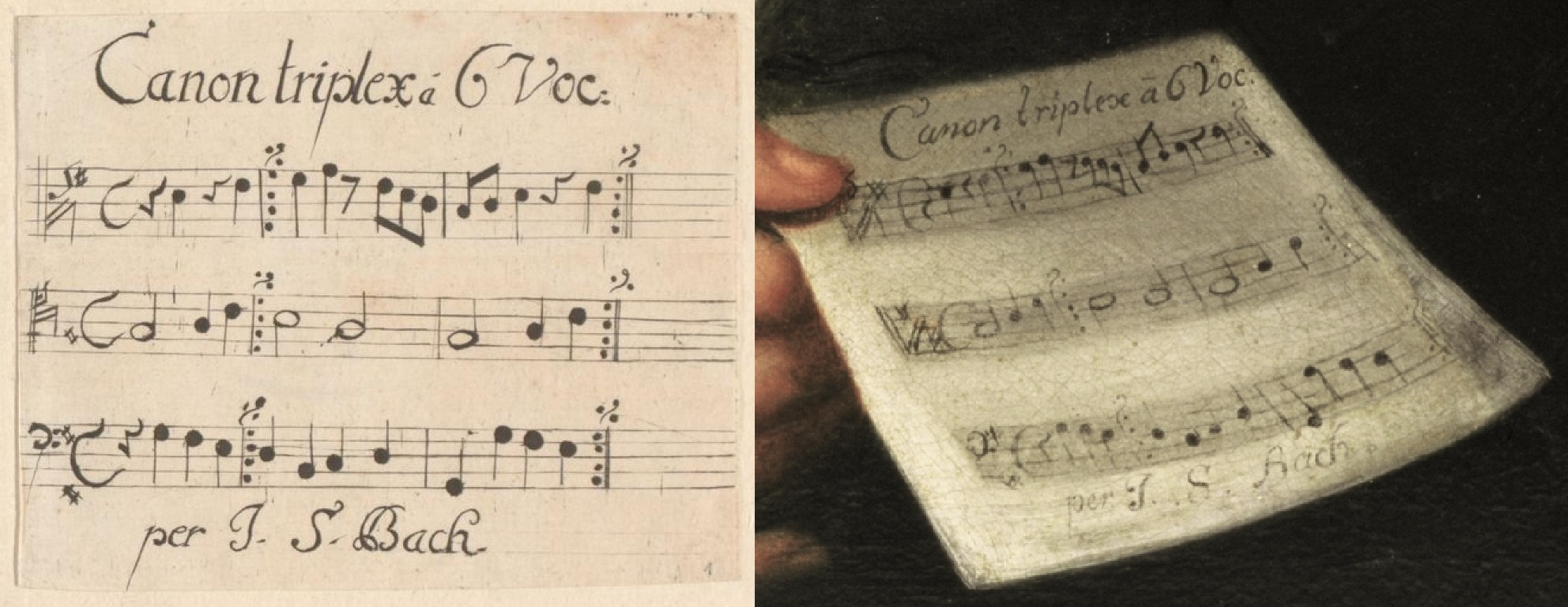
1748 - BWV 1076 Oilpainting by Elias Gottlob Haussmann
In the painted portrait, Bach wears a white blouse, without a single ink stain, with the sleeves tight around the wrist. Clothes were washed in salts from plant remains and could resolve ink.
The painter has depicted the material expression of paper with light, shadow effect and spatial representation. The surfaces of the stafflines as a whole have been given a darker gray value. When brushing the letters it was difficult to correctly display the perspective inflection. Paper surface, stafflines and words seem to move in different dimensions. Compared to the engraved example, the title is aligned more to the right, there was no ambition to set it up again. Some stems shifted from left to right, the placement and spacing of the notes is more balanced than on the engraving. The gray note heads nicely indicate how deep black can light up. The simile marks at the end of the staves connect smoothly with the first double barline. For the second C clef, the painter has looked at the already painted example on the first stave, instead of the engraving, resulting in the suggestion of an accidental that should not be there. There is the illusion of a second underlying sheet of paper, the demarcation with its higher gray value gives a nice spatial depth, but the edges are rather vague. In copies of this painting it often disappears.
All in all a pretty good representation of the engraving, easy to read and something to be proud of.
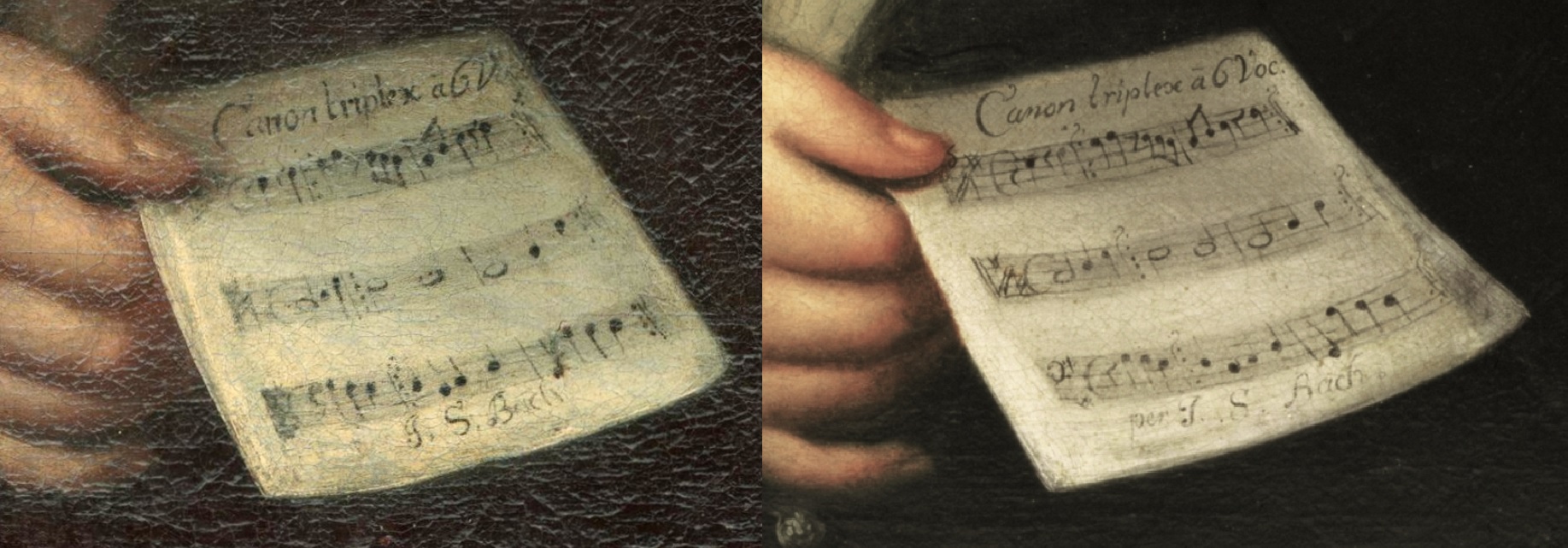
The clefs are somewhat vague, stems faithfully follow the engraving, two simile marks are missing. Both have somewhat wider side margins, and the alignment of the written music is distributed over the entire staff. The abbreviation Voc: collides with the folio edge, which is obscured by shadow effect. The suggestion of several pages is now called up on the right side. The spatial suggestion of writing and paper surface is more coherent. The black of the ink is heavily applied, which contrasts with the sfumato atmosphere of the whole. The score is presented to you as a viewer in a more inviting way, which is completely in line with the intended assignment.

Various ambitions and strategies are visible: three-dimensionality and material expression of paper versus legibility of writing. The written music fragment is relatively very large and two-dimensional. The reading direction is at five o'clock, and an attempt has been made to suggest rather than write exactly, but again not so obscure as to be unreadable.
The position of the hand is similar to that in Hausmann's portrait, and again, of course, no ink stains on the clothing. But for the variation, torso and head are in opposite direction. This set-up betrays a falling back on templates, avoidance of working from direct observations and the inability to be inspired by what could be done within the given framework. It can also be seen as substantiation that this painting was not made from observation, but a reconstruction based on examples. Working to reality translates in details, which are here non-existent. We can be satisfied that Bach did not have to see this.

The painted posture has predecessors, the different directions of limbs, trunk and head seem to be motivated again by the desire to paint contrasting directions of form, without a pleasant coherence of the whole, which falls into place with the uncomfortable frowsing. Imagine that you are sitting in this position, look at the chair, Bach is sitting on another chair or he was able to manifests physically like a Picasso Barbapapa in a cubistic reality.
The wall of his studio and the keyboard instrument with music stand at the ready are likely staged for the painting, but might also be based on direct observation.
The folio's in the left hand are a little apart at the fold, which we also see in Bach's manuscripts, which also do not have a sharp fold.

From the collective manuscript with an apple logo on its cover.
The folio shows writing of four differently carved quills.On the top three staves, BWV 769a is notated in black ink by Bach in his good days. After that, there are two groups of three-line double staves for an incomplete revision of choral prelude BWV 668, with the ink of both staves and notes indicating different sessions on different days. There is a small test in the bottom right, which has been crossed out with a fourth quill in black ink, making it stand out rather than disappear, some numbers have also been overwritten with it.
The story of Bach dictating his last music comes from oral history, and as usual its shaky foundations have been questioned. The preface to the 1751 printing of the Art of the Fuge reports that the blissful man in his blindness spontaneously dictated the chorale to one of his friends.
Dictating notes was new, a system had to be invented. The double row of numbers at the bottom left was initially written in the same ink as the last group, which may have been helpful. However, the writing is fluently written, an oral note for note dictation cannot be read from the music. His visual handicap may not have prevented him from playing the music or singing, although he may have been weakened by untreated diabetes. Bach and Altnickol knew the old version, besides the title it were small ritmic revisions that had to be communicated.
The chorale melody has similarities with the upper voice of 13th canon BWV 1076, the addition to the Godberg Variations, and is also used in several other compositions (BWV 738, BWV 606, BWV 243a, BWV 248). His curieus mind kept investigating new ways to explore what is possible.

The three stages of writing styles of the words seem like a resurrection. Langsam and Violoncello seem to be written with a shaky hand but are not, the shape of the letters are based on the standing kurrent, where the longer lines are composed of short strokes. Not an age ailment but stylish. Using the kurrent in the top margin is atypical for Bach. The musical notation is accurate and fluent.
The lyrics anticipated life after death: "Wake us up".
The music had to be performed with "Lebhaft": lively.


The monk Benedict lived as a hermit in a cave for 3 years. At the end of his life in the 6th century he wrote monastic rules as a guide for beginners: you always remain a student, every day is a new opportunity to grow and learn. It's about the moment, about the day itself, do everything you do with attention and dedication. It's about giving your attention to what demands attention from you at that moment.
The Ricercar and Benedict look different. Black ink versus brown, crisp soot versus ink corrosion, straight staff lines versus sagging, a sharp nib versus a worn one. Is this collection of contradictions characteristic of his last years or can we point it out in other decades as well?
Bach was operated on for cataracts in late March and early April 1750, he will probably have been suffering from this for some time, the symptoms appear so slowly that it goes unnoticed.
The handwriting of his last years has been described as laborious, irregular and angular.
I don't see that, the writing looks fine to me: smooth, confident, graceful. The only thing I noticed is that here and there the layout of the staves is sometimes a bit messier than usual. They require a lot of visual and motor control, and sometimes you're just a little tired.
Compare the Benedictus with the Tombeau for princess Christiane Eberhardine from 1733, there is little to go on for a chronologic dynamic development of his calligraphy. The worn quill, the rough notation, Bach was clearly exhausted when he wrote this down. There is more to understand when you consider the context of the day.
The art of the fugue, the Great Mass, the motet of his profundis uncle, the dictated chorale, the Tombeau, they are connected with tall tales. Unraveling the calligraphy part in it requires objective hands-on experience. His earliest writing shows the tidiness of his older brother, the transition to looseness sets in early, small changes in habits have no logical sequence as calligraphic development. There are major differences between the scores, which are mainly related to workload, the attention and dedication of the moment and coincidence.


The BACH signature cross, a cross shape of two staves, with a single note in the middle, which are given the note value B a c h by four clefs and two accidentals, cannot be found in his scores. Yet he himself is omnipresent in his scores.


Lyrics: "So now give thanks with your mouthful".
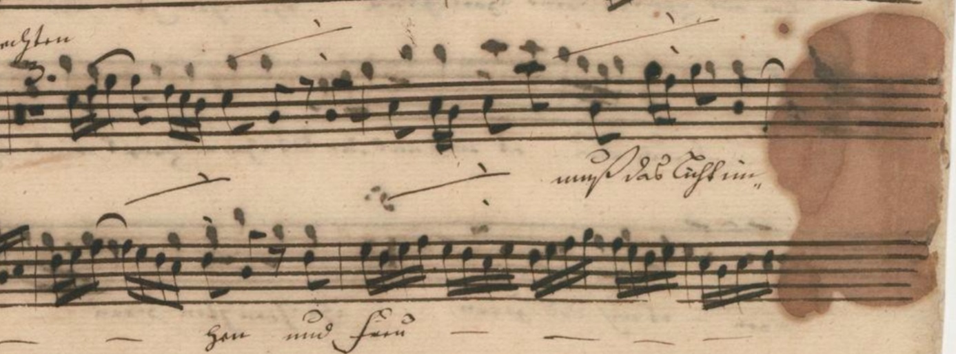
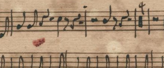
You need a lot of knowledge to be able to realize with insight what you don't know.
The wing beat of a butterfly can be the deciding factor between good weather and a hurricane, systems are highly sensitive to differences in initial conditions.
The philosophical notion of multiple universes can invite to contemplate some specific altenative universes.
If you disregard the moral implications and focus on the artistic expectations, what can you expect from a scenario where science extracts Bach's DNA from scores and manages to create a clone? Another person with the same extraordinary talent for creativity? Bach's world is gone, the baroque with its expressive harmonic vocabulary is behind us. He could get a university education, would that yield more artistically? Would it be doom or as if god has returned to earth, a theme that is frequently addressed in Bach's art? Or could he just live a quiet happy life as a bicycle repairman, artistically nothing special, but pleasantly fulfilling and meaningful?
Can the DNA code be used to construct an artificial brain, a model for research? Connect it to a robot body capable of human locomotion, feed it a simulated baroque world, with an eagle eye and knowledge of artistically relevant music, and let it compose and calligraphy?
This might be somewhat out of the box compared to the goal of getting a grip on calligraphy.


Many holes in Bach scores are the result of ink corrosion, but something else is going on here. The ink is largely based on soot-bister and there are few visible rust discolorations from ink in the notes. The typical edges of the holes rather indicate a fire in the house, which has been extinguished with a boar bristle brush richly dipped in ink, soot meets soot. The oboe score served as a temporary backdrop. Panic, too much empathy for the meaning of the music or thorough performance?
The surviving scores in Sebastian and his copyist's handwriting are the only surviving cantatas by Ludwig, long regarded as Sebastian's work because of that handwriting.
We may have a glimpse into a scene with what happened to the score of the St Matthew Passion. Sparks fly from a tobacco pipe making their way through paper. The engraving by Christian Friedrich Boëtius shows what those pipes looked like.

The tobacco available in Leipzig came from America, where it was grown on large slave plantations. Pipe smoking was adopted from native Indians. A common teaching among them while smoking involved having good attitudes and thoughts carrying thoughts and prayers to the spirit world.


Recently, Staedtler promoted their brand with a historical pencil making set. The wax seal was made of plastic which needed to be glued on the wood.


This might be a recipe from Taube's Cookbook. When you write, your right hand rests on the paper, leaving a film of skin fat, cells and sweat, invisible but present.

A farsighted pupil reminiscent of failed eye surgery. Bach underwent two surgeries four months before his death. After the operation Bach got eyedrops of blood from slaughtered pigeons, pulverized sugar, or baked salt. Ten days before his death, he suddenly regained his sight. Medically this is inexplicable, possibly a result of a delirium, an illusory imagination.
In this chapter I have tried to write down what strikes me at first glance when you look at Bach's scores from the point of view of how it was written. It is a structured limited selection. While virtually leafing through the pages, I sometimes checked what I saw against what I could remember reading in secondary literature. Seeing and interpreting are error-prone personal undertakings. I have frequently expressed myself firmly and am partially aware that there is an illusory effect in it. It might be a bloody mess at times. But I stand for the method: back to the source, observe, evaluate critically, making it transparent. They are basis and framework for action: doing it yourself.


Watch out for the ssharp ssmacckss.